
In this assignment, you’ll visualize the data you organized about WSU tuition using Tableau Public, a free software program popular in newsrooms, business and academia.
Introduction: About Tableau
Tableau is a leading data visualization software company, with headquarters in Seattle. Their software products are marketed to businesses as a way to explore and gain insights from large datasets, including web analytics. A free version of the software, called Tableau Public, is popular in news organizations as a way to publish and visualize data stories.
The free version differs from the paid version in that your underlying data is made public when you publish a visualization, which is not a problem if you are using public data anyway.
Like any software program, there is a learning curve to figure out how the program works, and Tableau can be perplexing for first-time users compared to simpler visualization tools. So why bother learning it? It’s increasingly an in-demand skill from employers, and it has potential for sophisticated and customized data visualizations that would otherwise require advanced coding and programming skills.
To use Tableau Public, you download the software to your computer and then sign in when you want to publish a visualization. Let’s get started…
Making Visualizations in Tableau
Using the WSU tuition data, you’ll be creating four charts and combining them into a single interactive to publish on the web.
1. Download and install Tableau Public to your computer: https://public.tableau.com
(Make sure to choose Tableau Public, not Tableau Desktop. It can take a while… it’s best to do this ahead of time.)

Although your visualization will eventually be published online, the working space is entirely contained on your computer, so you don’t need an internet connection while you work.
If your operating system is out of date, you may not be able to download the program. The best option for security and software performance is updating your operating system (this is almost always free), but you can also try using an older version of Tableau Desktop: https://www.tableau.com/support/releases
2. While the program is downloading, make sure your data is accurate and well-organized. Unlike Excel or Google Sheets, Tableau is focused on visualizing and uniting similar datasets rather than formatting, filtering and manipulating data. It’s best if your data is already in excellent shape before you bring it into Tableau.
We’ll be using the data from the previous assignment. We’ll also need a column for inflation-adjusted out-of-state tuition, so update your spreadsheet or use this completed spreadsheet: Com475-WSUtuition-1970-2022.xlsx
These instructions use the spreadsheet header names found in that file. Your column names may differ slightly depending on what labels you chose. Please note that the screenshots for this assignment show slightly older tuition data to avoid giving away exactly how your charts and data should look.
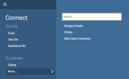
3. Once Tableau Public is installed, open the program and you’ll get the option to connect to a data source to begin your first project.
- If your spreadsheet is an Excel file, you can click “Excel” and locate your file.
- If your spreadsheet is a Google spreadsheet, you can connect to Google Sheets from Tableau, or you can choose to download your spreadsheet an an Excel file and upload it that way.
Your data should begin to load automatically, though this can also take a while.
Connect to your spreadsheet to load the data.
4. Your data will appear — make sure it looks correct. Then click the “Sheet 1” button at the bottom to advance to your chart workspace.
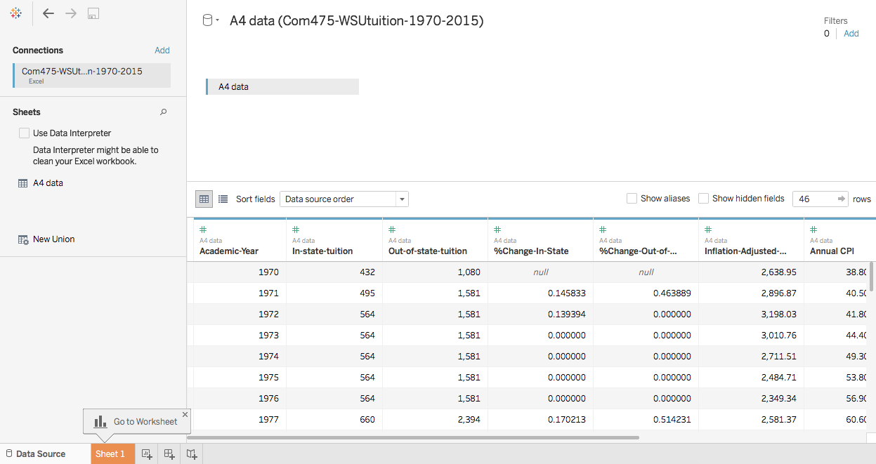
Everything look the way it’s supposed to? Then click the button for Sheet 1, helpfully highlighted in orange. Please note that the screenshots for this assignment show slightly older tuition data to avoid giving away exactly how your charts and data should look.
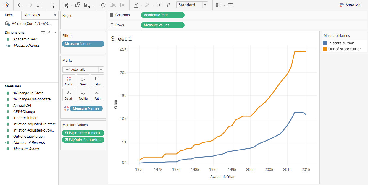
5. Now you’re in the interface where you can begin to visualize and combine data. On the left, your spreadsheet data is automatically sorted into Dimensions and Measures. These can be dragged into the middle area to start making combinations. We’re going to start with a simple line chart showing in-state and out-of-state tuition rising over the years.
Drag “Year” from the Dimensions panel over to the area labeled Columns. Tableau calls these areas “trays.”
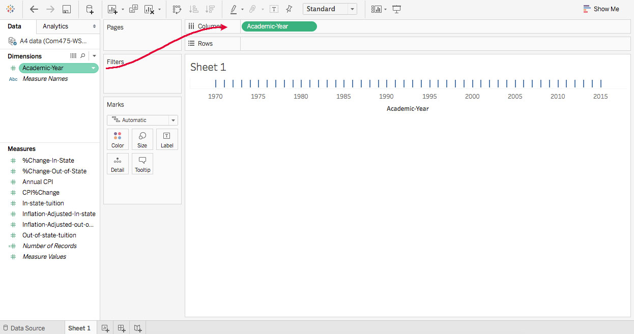
Drag the data with the years into the Columns tray, and tick marks should appear across the empty chart area.
6. Drag “In-state-tuition” into the Rows tray. A line chart should appear below, which shows tuition increasing over time.
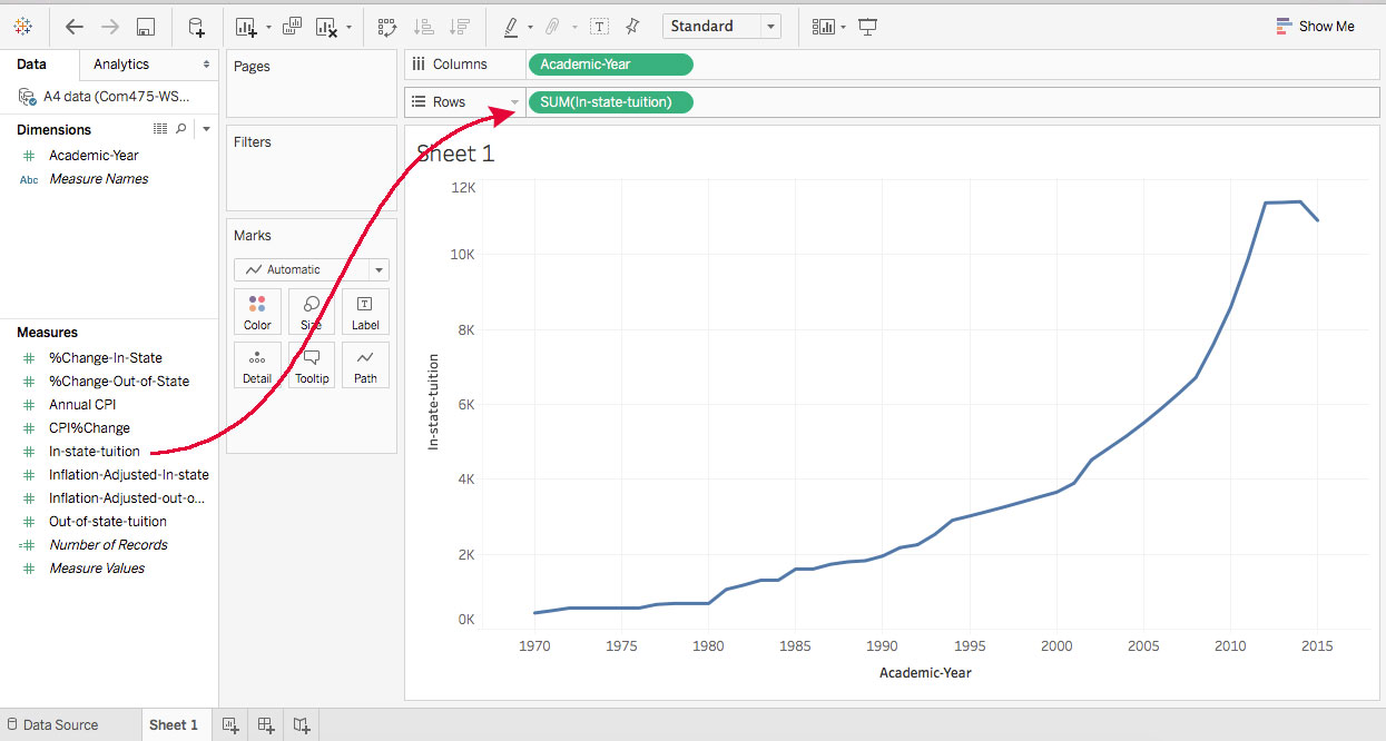
Drag your data into the Rows tray, and a line chart will appear.
7. Drag “Out-of-state-tuition” into the top left corner of your chart, essentially on top of the 10K and 12K labels. (Two little bars will appear in that space.) This will add that data to the chart.
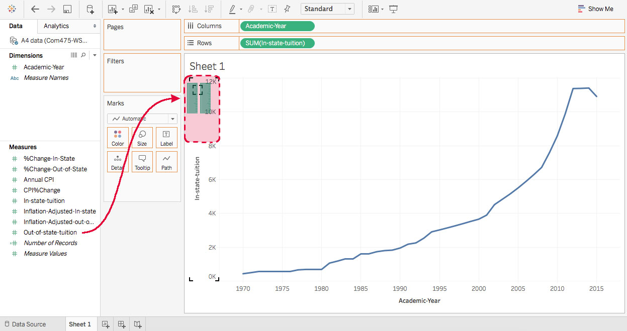
If any step doesn’t go correctly, use the back arrow in the top left to undo.
Both lines should appear on the same chart. If they appear in separate charts, undo and try it again.
8. Now we need to do some formatting and labeling.
- Double-click the chart title (currently “Sheet 1”) and a box will pop up to let you change it. Type an appropriate title, such as “Washington State University Tuition, 1970-2022.”
- Double-click on left axis title to change the generic “Values” to a more descriptive label like “Dollars.”
- Click the “Color” button and edit the colors. Select the “Tableau 20” color palette for a good selection of colors, and choose two darker shades for these lines. (In a later chart, we’ll need lighter versions of the same colors.)
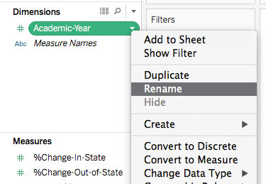
- In the Dimensions and Measures panels, click the arrow next to any label to rename that category if you need to adjust them for readability. (For example, changing “Year” to “Academic Year” for clarity.) This will automatically update on your chart.
9. Before we create another chart, it’s a good idea to save your project. Click the disk icon in the top left or go to File > Save to Tableau Public. At this point you’ll likely be prompted to create an account. You can use your WSU email address or a different email, depending on your preference.
10. Now it’s time to make the second chart. At the bottom of your workspace, click the “New Worksheet” button next to your existing worksheet. This process will be largely repetitive, but with different data.
- Drag “Year” into the Columns tray.
- Drag “In-state-tuition” into the Rows tray.
- Now things get slightly different: Drag “Inflation-adjusted-in-state-tuition” into the spot at the top left of your chart to add that data.
- Edit the colors, and use the lighter shade of the color you chose for in-state tuition. This will help indicate that these lines are variations of the same data.
- Change the title, left axis label and any other text as necessary.
Now you should have a line chart showing in-state tuition in two ways — one line for the actual cost, and one line for what the cost would be in 2022 dollars.
11. For the third chart, we’ll do the same comparison for out-of-state tuition.
- Click the “New Worksheet” button to start a new chart.
- Drag “Year” into the Columns tray.
- Drag “Out-of-state-tuition” into the Rows tray.
- Add “Inflation-adjusted Out-of-State Tuition” to your chart.
- Edit the colors, using the lighter shade of the same color for the inflation-adjusted line.
- Change the title, left axis label and any other text as necessary.
12. The fourth and final chart will be different. This will show the percent change for in-state tuition and use color to highlight the recent decrease.
- Click the “New Worksheet” button to start a new chart.
- Drag “Year” into the Columns tray.
- Drag “%Change In-State” into the Rows tray.
- To change the chart type from a line chart to a bar chart, click the dropdown menu under “Marks” and choose the bar chart type.
- Drag “%Change In-State” (same one you just used) into the bottom of the “Marks” tray. Then click the icon next to it and choose “Color.” A color scale based on the data will be applied.
- Click on the color button to edit the colors, and either reverse the scale or choose a different diverging color scale. Bars representing increases in tuition (most of them) should be a color like red or orange to indicate an increase, and the one year showing a decrease should be a contrasting “calm” color.
- Give your chart a title like “Annual Percent Change in WSU In-State Tuition” and adjust any other text labels as necessary.
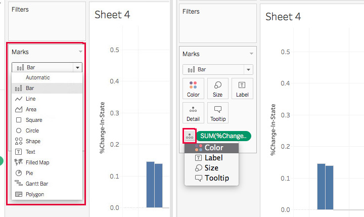
On the left, changing the chart type. On the right, using the same data to affect the color values.
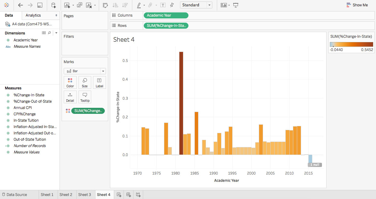
The colors should now correspond with the data represented by the bars.
13. Save your workbook online and export images that show each chart.
- In Tableau, go to File > Save to Tableau Public. If you’ve saved before, go ahead and overwrite the previous version.
- This should take you automatically to your online Tableau Public profile. In the top green bar that appears when you publish, or by the title underneath the visualization, click on the “Edit Details” link.
- Click the settings box for “Show workbook sheets as tabs.” This will allow all your charts to appear in tabs the same way they did when you made them in Tableau.
- In the gray bar at the bottom of the visualization, click the “Download” icon and choose the PowerPoint option. Follow the instructions to download the PowerPoint file.
- The PowerPoint file should automatically include all your charts, though it’s a good idea to check. This is the file you’ll submit. It’s a handy way to quickly save charts for presentations, too.

After saving to Tableau Public, choose the “Edit details” option. This is similar to changing the title and settings when you upload a video to YouTube.
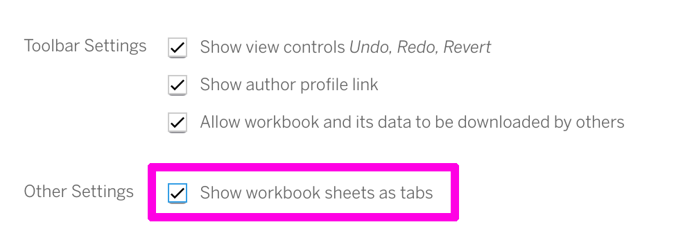
The “Show workbook sheets as tabs” is unchecked by default, so click that box.
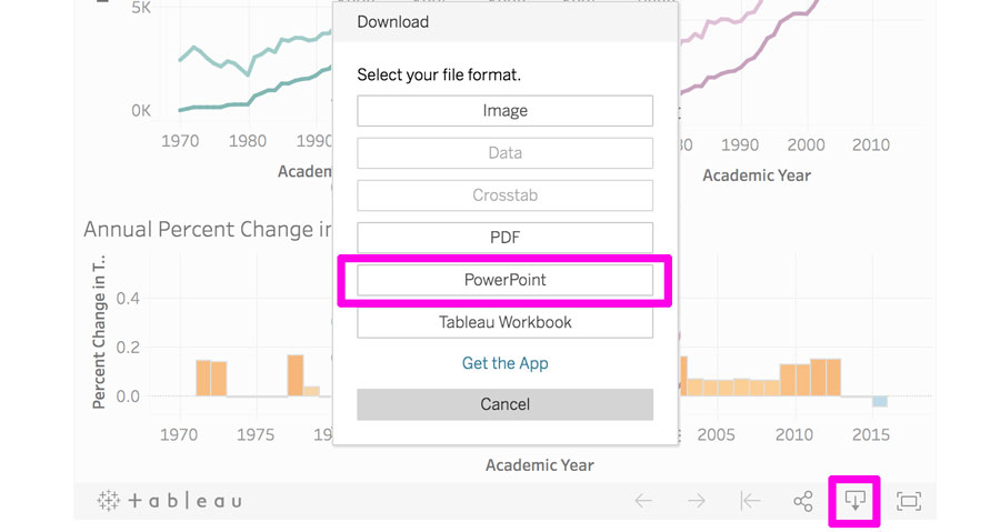
Click the download icon at the bottom of the visualization, and choose the PowerPoint option. (The other options may be useful, too.)
Submitting Your Work
Include the following with your Canvas submission:
- PowerPoint file exported from Tableau with a slide for each chart