
Data visualization is in a period of growth as a professional field, which means there are more tools and datasets available than ever before. It’s exciting, but can also become overwhelming or repetitive. To make the creative leap beyond the basics requires drawing upon personal inspirations and thinking about your audience. It means being open to feedback and rethinking assumptions about what works well.
As our focus shifts to your personal projects, here is a collection of short videos from creative data visualization practitioners discussing their processes and inspirations.
Interview: Audience, Text & Narrative Arc
This video is a condensed interview with Cole Nussbaumer Knaflic, an author and corporate design expert. Her brand and first book, Storytelling With Data, is well-known for making data visualization less intimidating. (If I assigned a textbook for this class, it would be that one, and you can often find a used copy for about $20.) In this interview, she talks about the importance of audience, text and narrative arc.
Video not showing up? Watch on YouTube here.
Presentation: Science + Art
This video is a short feature interview with Jonathan Corum, who is known for his science graphics. Science visualization often requires a lot of creativity to represent abstract or invisible concepts, plus the ability to accurately translate technical information for a non-expert audience. And illustration skills don’t hurt, either.
Here is his portfolio, if you’d like to check out some of the graphics he talks about and his more recent work.
Video not showing up? Watch on Vimeo here.
Presentation: Sequences and Surprises
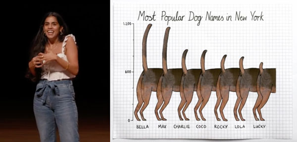
Mona Chalabi is a data visualization professional and artist who works for The Guardian in the U.K. She previously worked at FiveThirtyEight, and she’s done a lot of straightforward news graphics. But she is also known for experimenting with different storytelling platforms, like using Instagram for interactivity or incorporating real objects into her visualizations.
Watch this short presentation she did last year about capturing attention and how to use sequencing to reveal information: Sequence, Sequence… Surprise! Designing Data for Maximum Impact (the video should be at the top of the page)
Readings
• None!
Discussion
We’ll keep this one simple. Let everyone know what you’re working on this week for your project!
Project Ideas: Answer the following questions about your idea for your personal visualization project:
- What is your topic or idea?
- How did you come up with this idea or why did you choose it?
- What are a couple of your data sources?
- Have you encountered any surprises, frustrations or epiphanies at this point?