Last Week!
This is the last week of the course, and I’m very impressed by all the work this semester. Some of you had a little experience with this before, but it’s really pretty incredible how many completely new things you’ve tried in past six weeks, especially since the format of this course requires you to work independently. I appreciate your willingness to engage with the discussions and the assignments, and I’m hopeful that there are at least a few ideas or tools you can take with you and apply to your work in the future.
I’ve heard from a few students in the past that recruiters and employers asked about Tableau after seeing it on their résumés, so make sure to add that!
What’s left to complete:
- Personal Visualization Project, second portion
- Last two discussion questions
- Last quiz, which is review of key concepts from previous weeks
Additionally, please check the grading comments for your past assignments for any that need to be resubmitted because a file or link was not working properly.
Beyond the Course…
If there is anything that particularly interested you in this course, please let me know and I can suggest resources or next steps. Because data visualization is so interdisciplinary, it’s a topic that brings people together from many fields and professions, from all around the world. There are so many resources available online that it can be overwhelming. Here are some not-required things you can do after this course to continue building your skills:
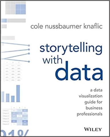
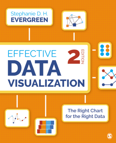
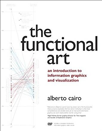
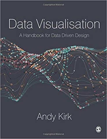
1. Read a book. Here are some good ones:
2. Learn more about Tableau. Now that you’ve had some experience with Tableau, it’s a great time to go back to the beginning and systematically learn about all the features and options. And if you get stuck, the user forums are very active and helpful.
3. Check out a MOOC. That stands for Massive Open Online Course, and a lot of universities make some classes open to the public that way. The Knight Center in the Americas offers MOOCs several times a year, and also makes resources open afterward. Along with Alberto Cairo’s introductory data visualization course, there are also classes on mapping, using R for data analysis, and more.
4. Join the society. We’ve had some readings and materials from the Data Visualization Society, and now you should consider becoming a member! It’s free to join with many free resources. There are a ton of beginners who are interested in dataviz and don’t even really know where to start — it’s much more of a community than an exclusive club, and it includes people from a variety of industries.
5. Take on a #SWDchallenge. Every month, Storytelling With Data hosts a design challenge on a particular theme. (Yes, eventually professionals miss school and do assignments for fun.) Anyone can participate, and the very-highly-respected Cole Nussbaumer Knaflic often offers feedback on Twitter and highlights creative entries. So it’s a fun way to build your skills and get your work noticed. This month’s challenge is creating a holiday card that includes data visualization.
Discussion No. 1
Let’s make one more weird little thing. Go to Google News Lab’s data gif-maker: datagifmaker.withgoogle.com
Choose one of the three templates and make a data gif with any data. Here’s a guide if you run into any problems.
Data Gifs: Make a Google News Lab data gif with any data, maybe something from your project or personal data:
- Include the link in your post so we can see it
- Can you think of any professional use for this tool?
Discussion No. 2
I’s easy to get caught up in the rush to finish things at the end of a semester, so let’s pause for a moment and reflect on what you’ve done well, and what you could do in the future.
Ending on a Positive Note: Write about the following:
- What is one specific thing you are proud of this semester? It could be taking on a skill you were uncertain about, solving a technical problem, using your design skills in a new context, etc.
- What is one concrete goal related to this class that you can carry forward? (Could be little, like adding Tableau to your résumé or looking at charts you see in the news more critically, or something bigger like continuing to learn a skill)
Assignment: Finishing the Personal Visualization Project
In the first part of the Personal Visualization Project, you researched possible data to use and did some initial visualizing or sketching to develop an idea for your data story. Now it’s time to make that data story happen by creating a full draft with your selected charts, then get outside feedback from people you know, and finally make revisions based on their comments to end with the best project possible.

