In this final project, you’ll get to use data visualization skills from throughout the course to share information about a topic of your choosing. This is an opportunity to practice what you’ve learned and apply it to something you are curious or passionate about. You’ll first submit a very rough draft, and then submit a polished final product.
This project is intentionally open-ended to give you freedom to create a product that reflects your own interests and style preferences. However, there is no need to feel overwhelmed! For early steps, there is a “For More Guidance” section if more specific guidelines are helpful. Please also ask for help at any step if you’re feeling unsure — just send an email explaining what you’re thinking so far, and what you’re unsure about.
The process:
- Step 1: Identify your topic and data sources
- Step 2: Make drafts of 4-5 charts using a charting tool of your choice
- Step 3: Choose your best charts (at least 3) and create a polished data visualization story with a tool of your choice
- Step 4: Solicit and reflect on feedback
- Step 5: Revise charts for final versions
Steps 1-2 will be submitted the first week as a draft (15 points) to show progress and get early feedback about the project idea. This portion is a lot of the work, but has a lower point value to reduce the pressure. If you decide to substantially change your topic after submitting that draft, you will need to check with the instructor about which previous steps may need to be completed again with the new topic.
Steps 3-5 will be completed for a final polished version (35 points). Ideally, a lot of the hardest work defining and exploring your project will already be done, so you can focus on refining your idea to produce a project that demonstrates excellent choices in the use of data, chart and tool types, logical storytelling, and design details such as color and text. You can choose any storytelling format that displays at least 3 charts in an effective way, such as a static infographic, a Tableau dashboard, a series of images for a social media post, a recorded slide presentation, or others.
This video goes through the instructions with an example of a professional project of mine that followed a similar process:
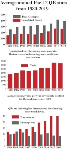
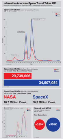
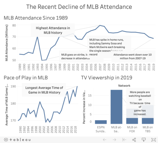
Here are a few examples from previous semesters, though please keep in mind that you have the flexibility to choose from a variety of formats:
Step 1: Find Data
To start, you’ll need to identify a topic and what you want to show about it. It’s OK if your idea shifts a little as you visualize the data in later steps, but your process will be more efficient if you start out with a strong idea of what you want to communicate.
1. Identify a focused topic with quantitative data that interests you. You may want to choose a topic related to something else you’re working on, such as an internship or club.
This can be public data, such as government data or research, or you can use personal data such as fitness tracking data or analytics from a website you manage. It can also be a combination of public and personal data. For example, you might measure your own use of social media in various ways and also use survey data about national trends in social media use.
2. Find at least four potential sources of data. Each source will likely contain several options for actually visualizing the data, the same way we’ve worked with many spreadsheets and data sources that contain a variety of data. Try to find the raw dataset from the original source; for example, if you find a report with summary statistics, the report should list the original sources or perhaps include the data in an appendix.
You are welcome to use sources we’ve previously used, such as Our World in Data or Census Reporter. There is a U.S. data portal and Washington data portal that may be helpful, and Pew Research Center is a good source. You can also use your own data, like analytics from a social media account you manage or survey results from research you’re conducting.
Please don’t hesitate to ask if you have an idea and don’t know where to find data! I would be very happy to offer some options so you can spend your time on the details.
If you’re not sure where to begin, choose one of these topics:
- An industry you may want a career in — look for Bureau of Labor Statistics and Department of Labor data, industry group reports, salary ranges
- Personal and national media use — look for Pew media research, TV ratings, data tracked by your phone
- Personal vs. Average Health — if you (or your devices) automatically track any health measures such as steps walked, calories or sleep, then compare to national averages or celebrities
3. In a text document, answer these questions:
- What is your overall topic?
- Who is your main audience? Who do you imagine being interested in this and how would they see it?
- What message do you want viewers to get from your visualizations? Another way to think of this is: What do you imagine the headline to be?
- List your four data sources with a link and 1-sentence assessment of whether the data is understandable and in a usable format (screenshots or file attachments work well if there is no link available)
Step 2: Sketch Your Data
Using the potential data you selected, narrow it down and create rough charts that communicate your message.
1. Create a spreadsheet file that includes all the data you plan to use, and make sure it’s formatted and organized in a way that will make it easy to use with Adobe Illustrator.
2. Create rough charts using any software program, such as Adobe Illustrator or Google Sheets.
- Create at least 4-5 charts that work in a logical order
- A variety of chart types can work well, but it is also fine to use the same types
- You don’t need to make all the labels and text perfect at this step, but make sure to include enough labels so all information is clear
- Save your rough charts in a file format you can submit and share.
Submit Your Work: Draft
Complete your assignment by submitting the following materials to Canvas:
- Text document
- Spreadsheet file with your data
- File showing the rough charts you created
Step 3: Making Complete Charts
Turn your draft charts into a polished version of your data story using your preferred tools from this course.
1. Create a polished data story that incorporates multiple charts to communicate a cohesive message.
- Choose a tool such as Illustrator, Tableau, Infogram or Flourish that allows you to combine multiple charts in one composition/dashboard, or you should have a plan for combining charts a different way such as in a social media post.
- Use 3-4 charts, either from your draft or from new ideas (some exceptions may be allowed for more charts, such as using a series of small multiples.
- Make sure to include enough text and labeling so all information is clear.
- Think about design consistency for colors, fonts, and graphic styles.
- Save a version that is easy to share, such as a single PDF/JPG or single link.
- Consider the needs and expectations of your target audience, and make it easy for them to view and understand your story.
If you’re not sure where to begin, here are tips for setting up a document in Illustrator for a static graphic or Tableau for an interactive graphic:
For a static infographic in Illustrator:
- Create an Illustrator web document 1000×2200 pixels
- Start with a headline at the top
- Put three charts below the headline in a logical order
- Search Google Images for “infographics” or “annual report” to find layouts, colors and text styles you can mimic — it’s fine to take inspiration from other sources as long as the work is all yours
Or, for an interactive graphic in Tableau:
- Use Tableau
- Create three charts and combine them into a dashboard
- Customize the colors and design choices so it doesn’t look like the generic Tableau defaults
- Spend time on the headlines and annotations
Step 4: Feedback and Reflection
Maybe your charts are great! Maybe you know they need some work. Either way, it’s useful to get an outside perspective about what’s working and what’s not.
1. Enlist two people you know to give you feedback as reviewers. It’s good if these people fit into your perceived audience for your project, but it’s also OK if they don’t. This should be a feedback discussion, but can be done in person, on the phone, via Zoom, etc.
If you do not have access to two reviewers, please email me as soon as possible and we can arrange for someone to give you feedback.
2. Show your reviewers the mostly-completed version of your data story from Part 3. Then ask:
- What was the first things you noticed or looked at?
- What is the overall message you’re getting?
- How would you explain this chart? (for each)
- What is confusing or unclear?
- What else would you be interested in knowing?
Tip: Try to avoid influencing your reviewers! It’s tempting to point out things you know could be improved, or to start explaining the project, but try to let reviewers speak first. Just say you’re required to get feedback for a class project and leave it open-ended.
3. In a text document, summarize the responses you got for each question, and answer these questions for a reflection:
- Did your reviewers notice and understand what you expected?
- Did your reviewers ask you any questions about the charts or data?
- What did you learn or what was unexpected from the feedback?
- What is a strength of your project? What is really good about it?
- Do you plan to make major or minor revisions, based on feedback and your own assessment?
- If you had endless time and resources, what changes would you like to make?
- Given the short timeline, what is the No. 1 change you plan to make?
Part 5: Final Versions
Put the feedback to use — and trust your own intuition and knowledge — to improve your data story. Focus your efforts on making your final version as clear and professional as possible.
1. Make updates and save an updated version for submitting. You will submit your data story in the format that makes sense for the tool you chose to use; for interactive graphics it should be a public web link, and for static graphics it should be a high-quality exported image, most likely PDF or JPG format.
2. Before you submit, take a screenshot of your completed project as it appears to you. This will be submitted as insurance in case there are any technical issues that prevent your final project from coming through properly when submitted. That way I can see how it looked to you.
3. In a text document, answer these questions:
- Overall, what do you think turned out well?
- How did you decide which chart types, colors and fonts to use?
- What did you change from your draft?
- If you could travel back in time, what advice would you give yourself when starting this project?
- What tool, principle or idea do you want to remember from this course as you move on to the rest of your career?
Submit Your Work
Complete your assignment by submitting the following materials to Canvas:
- Completed visual story as an exported file (PDF, JPG) or public web link
- Screenshot showing how the completed project appeared to you
- Text document with written responses from Steps 4 and 5


