
In this assignment, you’ll revisit data about enrollment at WSU campuses to remake charts using Adobe Illustrator instead of Google Sheets.
Adobe Illustrator is the professional standard for charts published in print and also used for many non-interactive charts on the web. It is especially useful for graphic designers, but even data visualization professionals who prefer to generate charts using code languages like R often still use Illustrator for text and final touches.
This assignment reuses the summary spreadsheet from the Charting WSU Demographics assignment.
Charting Data in Illustrator
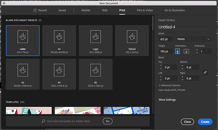
1. Open Adobe Illustrator. Go to File > New if the box does not immediately come up for a new document. Choose a new document size of “Letter,” meaning a standard 8.5×11-in. piece of paper suitable for printing.
2. Go to File > Save and save your Illustrator file. For all assignments in this course, always include your last name in the file name to differentiate your projects from other students in the class.
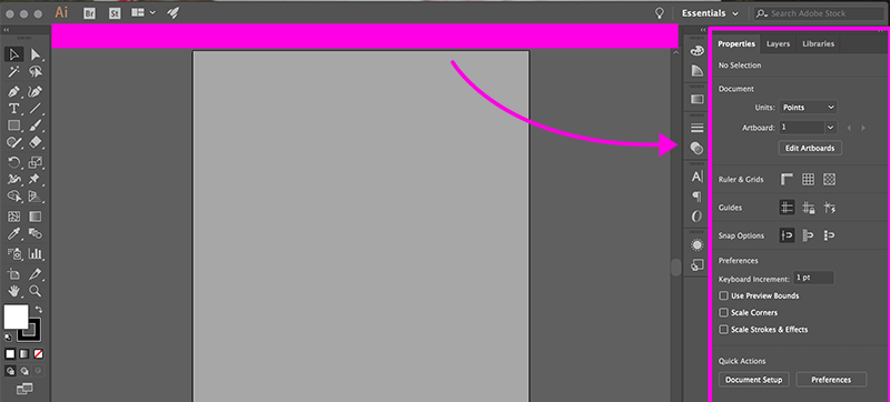
A note about Illustrator… The most recent version of Illustrator moves a number of settings from the top of the workspace to tabbed panels over on the right side of the workspace in the standard arrangement. So, the settings are still the same if you see that in screenshots here or in other tutorials, they’ve just moved.
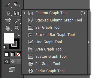
3. First, we’re going to make a pie chart. Click on the graphing tool icon, which is toward the bottom of your left-side toolbar. (If this is not appearing, go to Window in the top menu and make sure “Tools” has a checkmark next to it.) If you click and hold down, a menu will appear with different types of charts. Select the pie chart tool.
4. On your document, hold down Shift while clicking and dragging. Make your box in the top left of your document about 1/3 the width of the page. When you let go, a pie chart without any data will appear.
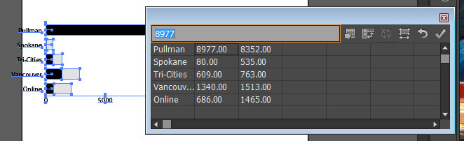
5. In the blank data cells, paste in the columns from the Campus and Total-Enrollment columns, this time leaving out both the headers and the Total row. (Use the keyboard shortcut — Command+V on Mac or Ctrl+V on Windows — or go to the top menu to Edit > Paste.) Click the checkbox button in the data window to apply the data. Wait, that doesn’t look right… If you’re seeing a line of circles instead of a pie chart, click the “Transpose row/column” button (second from the left) and click the checkbox again.
As usual, the data displayed in the images is slightly different than the version you should be working with.
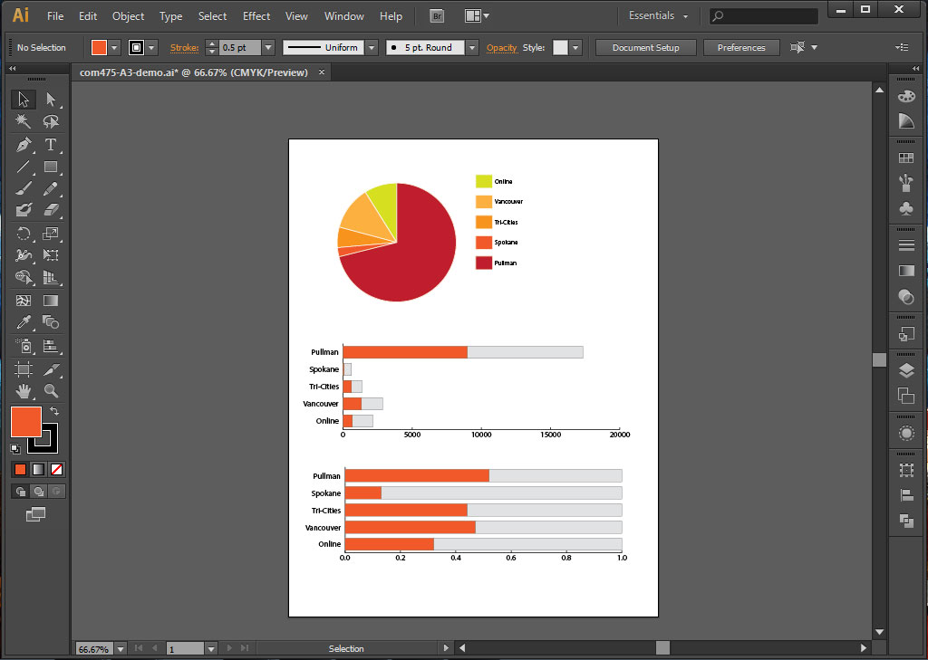
6. Now you have a pie chart! Click on the Selection tool (black arrow). Click the X button in the data box to make it disappear. With the chart selected, go to Object > Ungroup in the top menu. A warning will appear that you will no longer be able to change the data once you ungroup the chart. Click OK.
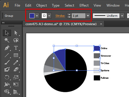
7. Go to Object > Ungroup to ungroup the chart again. Now each color is grouped, but you can select the slices individually. For each campus, change the stroke (outline) color to white and 1 point. Then change the color. The slice and the legend should change at the same time.
8. Next, we’re going to make a bar chart to show the number of male and female students at each campus. Click and hold the graph tool icon to show the types of charts, and select the Stacked Bar Graph Tool. Draw a rectangle that goes most of the way across the page and fills about half of the remaining space. A bar chart without data will appear.
9. In the blank data cells, paste in the campus names and then separately copy and paste in the headcount data. When this is complete, click the checkbox to apply the data. Yay, another chart! Go to the black arrow tool and click the X on the data box to close it.
10. To make our final chart, we’re going to start with a copy of the bar chart we just made. Select the chart, go to Edit > Copy and Edit > Paste. Use the black arrow tool to drag the chart to the bottom of your page so it’s centered in the remaining space.
11. With the copied chart selected, right-click or go to Object > Graph > Data. This will bring back the data box. Replace the headcount numbers with the percentages. Illustrator will not accept percentage symbols! Make sure your data is in decimal form before copying it, or delete each percent sign before clicking the checkbox to apply the new data.
12. Click on the Direct Selection tool (white arrow), which allows you to select parts of things. Click on one of the bars representing male students, and select a new inner color in the top toolbar or in the Swatches palette. Repeat this with the same color for all bars representing male students in both bar charts.
You can also add styles for female students or experiment with other style settings, such as changing the fonts and labels, but this is not required.
13. Now we’re ready to export this file. If any of your charts are too big for the page, select the chart and go to Object > Transform > Scale. Under “Uniform,” try something like 80% and click the “Preview” box to see how it will look. Adjust the scale until it fits on the page.
14. Go to File > Save As and select “Adobe PDF” for the Format at the bottom. Make sure it’s going to save to place where you can locate the file, then hit Save. In the next box that comes up, make sure the top setting says “Illustrator Default,” then click “Save PDF.” You will submit this document.
Submitting your assignment
Under Assignments in Canvas, find the corresponding dropbox for this assignment. Include the following with your submission:
- PDF with Illustrator charts
Alternative to complete the assignment without Illustrator
If you do not have access to Adobe Illustrator, you can instead practice these skills of transferring data into a software program by using Microsoft Word and Microsoft Excel.
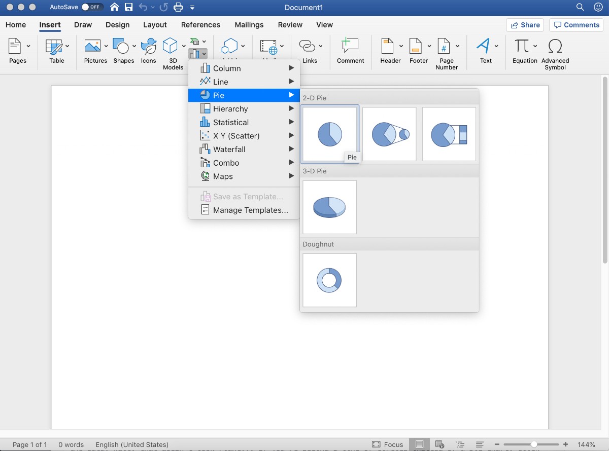
1. Begin by creating a new Microsoft Word document sized 8.5×11 inches and inserting a pie chart.
2. The data is managed in Excel, so an Excel window will open with sample data. Replace this with your own data.
3. Back in Word, you can customize the labels and colors as directed in the instructions. The options will not be exactly the same, but you can find the best alternative to complete each step of the assignment.