
In this assignment, you’ll organize data from WSU about student demographics using spreadsheets and then create charts using Google Sheets.
Part 1: Working with WSU Data
1. The Office of Insitutional Research, or IR, is a department at WSU that publishes data about WSU. Go to the IR website and download the file called Enrollment Briefing Summary Fall 2021 (Expanded).
IR > Annual Reporting & Surveys > Enrollment Briefings > Enrollment Briefing Summary Fall 2021 (Expanded)
IR used to post these files as spreadsheets, which made it much easier to use the data. The change to PDFs in Fall 2018 was not good for data accessibility, unfortunately.
Spreadsheets are used across many industries and disciplines as a way to organize data and make calculations. Microsoft Excel and Google Sheets are both software programs for creating and using spreadsheets. Spreadsheets use rows and columns, and each little box is called a cell.
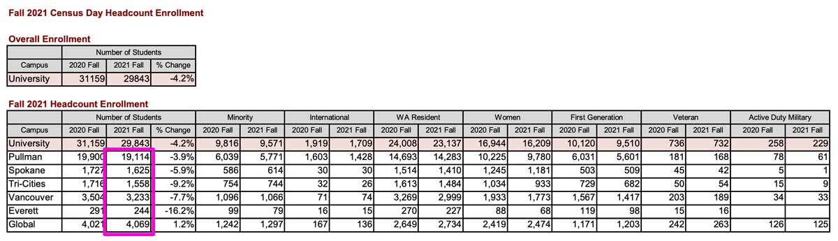
2. Open the PDF and see what information it includes. What is the purpose of this summary? Are the text labels enough to understand the information? Make sure you can find:
- The total university enrollment in Fall 2021, on page 1 and page 3
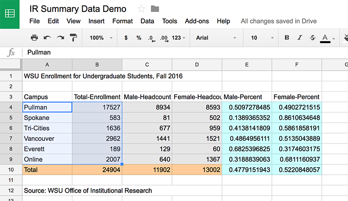
- The table called “Fall 2021 Headcount Enrollment” with rows for each campus and columns for different demographic categories
3. Download this summary spreadsheet called ComStrat475-A3-IRSummaryData-2021.xlsx and open in Excel or import into Google Sheets. First, fill in the gray cells with the corresponding information from the IR spreadsheet. Note that we are including data for undergraduate and graduate students.
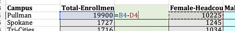
4. WSU’s Institutional Research document used to include columns for both male and female students. Now there is only a column for women students. Since the university uses binary gender data, we can subtract the number of women students from the total to find out how many male students are enrolled on each campus. This useful for our calculations, but it’s also a good example of how data can be limited or even biased since there is no gender identity option for students who are nonbinary.
Use a subtraction formula to fill in the green cells.
Most screenshots in the instructions use data from a previous year to avoid showing the exact answers.
5. Next, use a “sum” formula to calculate totals and fill in the orange cells across the bottom.
To enter a formula, click into the cell and always start with = and use the cell coordinates to indicate which data points you want to use in the formula.
Examples: =sum(B4:B8) or =C4/B4
For help on getting started with formulas, review this starter guide.
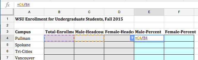
6. Finally, fill in the “Male-Percent” and “Female-Percent” columns (the blue cells), including the bottom “total” row. Calculate a percentage by dividing the part by the whole, i.e. 5/10 = 0.5 = 50%
Here’s a demonstration of the formula process using data from a previous year to avoid giving away the answers:
7. Save your spreadsheet to submit later.
Part 2: Charting the data in Google Sheets
Ready to finally make some charts? In this part, you will chart the data we previously organized using the charting tools in Google Sheets. A benefit of using Google’s tools is that you can publish your charts to display or embed on the web.
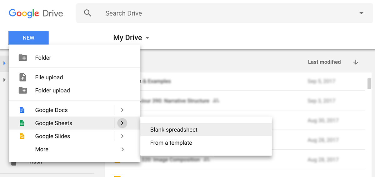
1. You can access Google Sheets through Google Drive, which you have automatically if you already have a Google or Gmail account. If you do not already have a free account, create one here for the purposes of this course: https://accounts.google.com
Tip: Although you can access your Google account in any web browser, the programs often work best in Chrome since this is a browser developed by Google.
3. If you already have your IR summary spreadsheet from Part 2 saved as a Google spreadsheet, you can just open it. If you have your data saved elsewhere, copy it into a new Google spreadsheet.
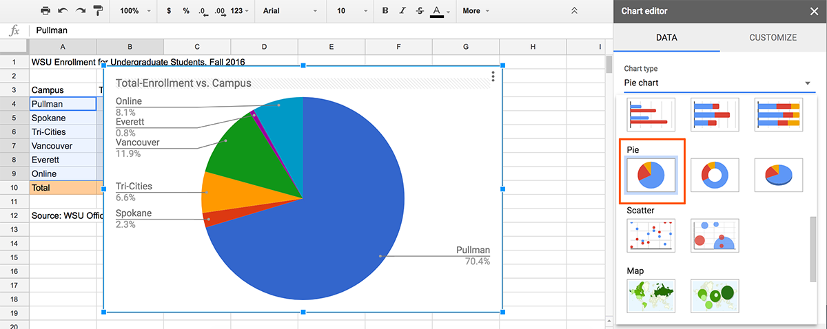
4. Now we’re going to create a quick pie chart to try out the charting tools.
• Select the cells in columns A and B that include the individual campus names and total enrollment, including the column headers. (Do not select the “Total” row, since our pie chart will show parts of the whole rather than the total.)
A reminder, this screenshot is showing 2016 data rather than the current data that you should have. So don’t expect them to match exactly, but you can still check that it’s turning out roughly the right way.
• In the top menu, go to Insert > Chart. The Chart Editor tools will pop up on the right side of the screen. From the “Chart Types” dropdown menu, select the pie chart option.
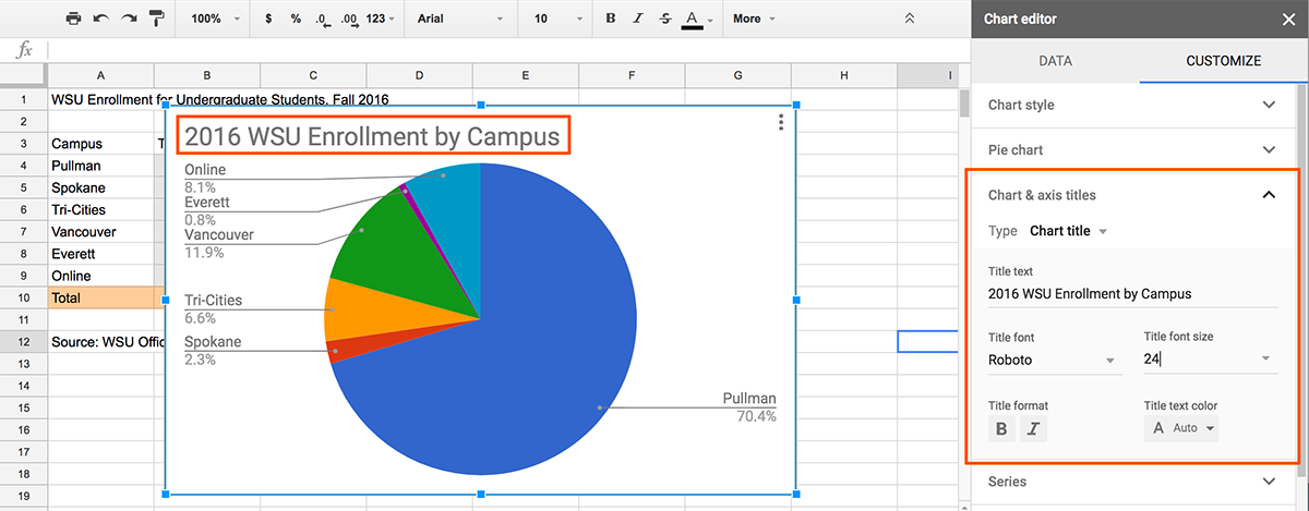
• To edit the chart title, click on the “Customization” tab or click the default title directly on the chart. Change the title to “2019 WSU Enrollment by Campus” and change the title size to 24 to make it slightly larger.
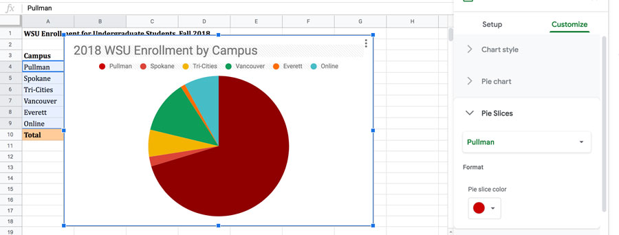
• At the bottom of the customization options under “Legend,” change the type to “Top” to show a key for your pie chart slices. (The default “labeled” option is usually a good choice, but for the sake of this assignment we want to try something other than the default.)
• Finally, in the customization options under “Pie Slices,” you can change the color for each category of data. Change the Pullman slice to a crimson color.
• Close the Chart Editor options when you’re done editing the chart, or just click anywhere else on your spreadsheet. (You can always return to the editing window.)
Hooray, a chart!
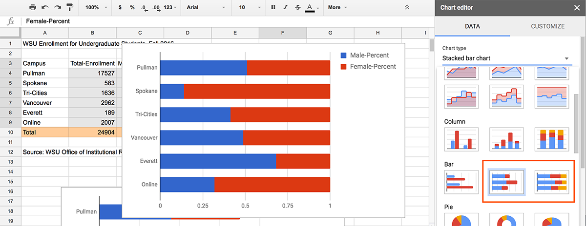
5. Next, we’re going to make two bar charts representing the proportion of male and female students at each campus. We’ll make a bar chart with the enrollment numbers first.
• Highlight the cells in column A for each campus name and the row header, then go to Insert > Chart.
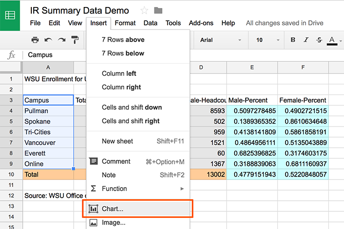
• There is no default chart this time because we haven’t selected any numerical data yet. Click on the data range option, and click the little grid icon on the right to open the window for choosing more date.
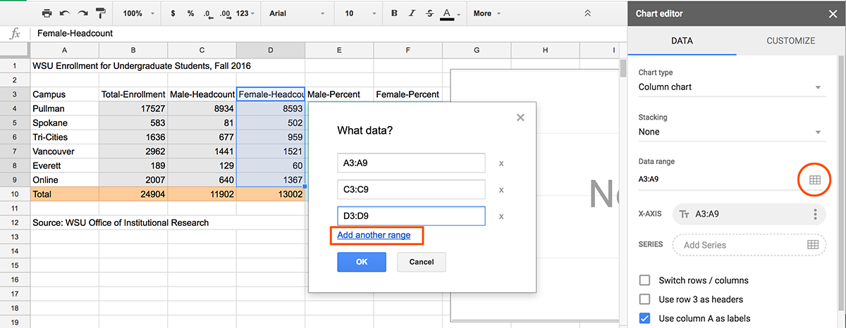
Some of you may see this interface, where you can select the data range and it will automatically give you chart options.
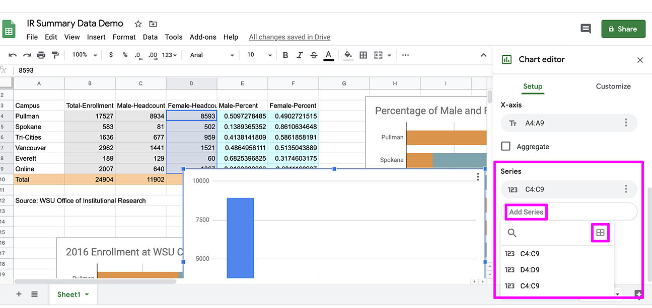
If you choose a range and the chart still says “No Data,” when scroll down in the options to the “Series” section, click “Add Series,” and click the grid button there to select your data.
• Choose the option to “add another range.” Select the corresponding data for the Male-Headcount column, then add another range for the Female-Headcount column.
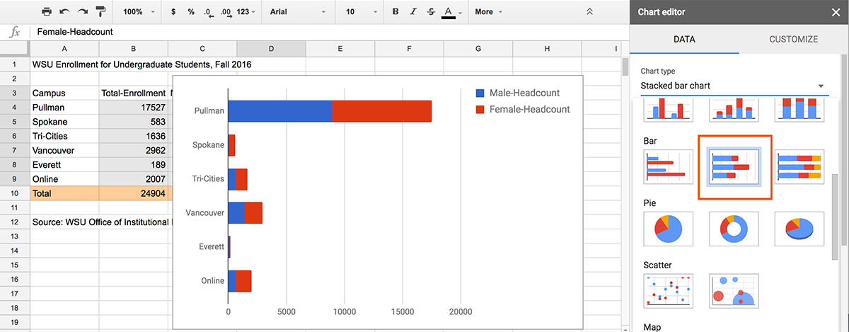
• Click OK to return to the chart editor with your new data. Go to the chart type options and select the “Stacked Bar Chart” type.
• Go to the Customization tab and give this chart an accurate headline. Think carefully about the best way to describe this chart to someone who was seeing it for the first time!
• Change the color of the bars, and try other settings like moving the legend or gridlines to improve your chart.
• Close the editor window when you’re done to save your chart.
6. One chart to go, this time with the percentage data.
• Start like before: Highlight the cells in column A for each campus name and the row header, then go to Insert > Chart. Click the grid icon to open the data selection box.
• This time, choose the data from the calculated Male-Percent and Female-Percent columns. It’s fine if your data is formatted as decimals or as percentages.
• Choose the same “Stacked Bar Chart” chart type. This time, all the bars should extend across the chart because each one totals 100%. You can check that this is correct by trying the “100% Stacked Bar Chart” and making sure they look the same.
• Go to the Customization tab and give this chart an accurate headline, new colors and any other changes you’d like to make.
• Close the editor window when you’re done to save your chart.
7. Now it’s time to publish your charts so they’re viewable online.
• From the three dots dropdown in the top right corner of the pie chart, select “Publish.”
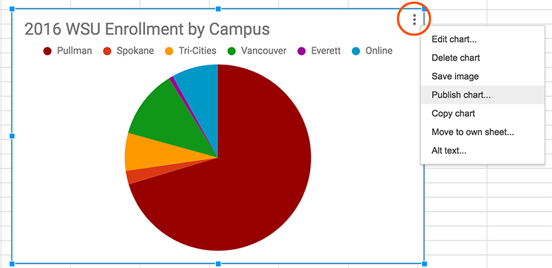
• Copy the link and test it in your browser to make sure it works, then save that link for submitting.
• Repeat with your other two charts, so you have a total of three links to submit.
Written reflection questions
Answer these questions in 2-3 sentences apiece in a text document.
- Looking at the original Institutional Research summary, what is one significant way enrollment changed from Fall 2020 to Fall 2021?
- Suppose you are writing a press release for WSU about enrollment trends. It is good for the university to show increasing enrollment. What is one statistic or piece of information from the IR summary that you would highlight that is positive for the university?
- What might explain why the Spokane campus has a higher percentage of female students? What might explain why there are more female than male Global Campus (online) students? (Take a guess even if you’re not sure.)
- The bar charts we made all represent the same information. What does the chart with the number of students show well, and what does it show poorly? What does the chart with percentages show well, and what does it show poorly?
Submitting your assignment
Include the following as attachments with your submission:
- Spreadsheet with summary data filled in from IR
- Three chart links pasted into the “Text Submission” box
- Text document with your written answers