
In this assignment, you’ll use pivot tables to find trends and summarize information from large spreadsheets of raw data.
Part 1: Survey Data Pivot Table
For this and most assignments, you can use either Excel or Google Sheets to create spreadsheets. If you want to feel more comfortable with the basics of either program, it’s recommended that you go through Part 1 of the “Spreadsheet Basics for Journalists” series. (The whole three-part series is a great exercise if you want to get an advantage for upcoming assignments.)
1. In previous semesters, students have used a survey to collect student demographic data. The survey asked these questions:
- In what month is your birthday? (Choose from list)
- Are you male or female? (Male, Female, Other/Prefer Not to Say)
- What year are you in school? (Multiple choice or type-in other)
- What is your major at WSU? (Type any answer)
- Are you from Washington state? (Yes, No)
- How much do you like Washington State University? (Scale from 1-5)
- How much do you like the University of Washington? (Scale from 1-5)
2. Open the survey results spreadsheet, and copy-paste all the data into an Excel file or a new Google Sheets file to create a copy of the data for yourself. Look through the data and assess whether it seems useful or not. Where are there inconsistencies? What categories might we be able to visualize?
3. Most of the data collected is nominal or ordinal data, meaning we need to tally up the categories before we can draw conclusions or make any charts. To do this, we can use pivot tables in Excel or in Google Spreadsheets. To create a pivot table, it’s important that each column of your spreadsheet has a descriptive header in the first row.
Instructions for Excel: https://support.office.com/en-IE/article/Create-a-PivotTable-to-analyze-worksheet-data-a9a84538-bfe9-40a9-a8e9-f99134456576
Instructions for Google Spreadsheets: https://support.google.com/docs/answer/1272898
Most spreadsheet instructions in this course will show the steps using Google Sheets, because this is a free software program available to anyone with a Google account. It also has the benefit of saving your work to Google Drive, so you don’t risk losing files. However, using Excel is fine if that’s your preference, and the steps are usually very similar.
4. Create a pivot table to tally up answers to the question “Are you male or female?” If done successfully, it should show you how many survey respondents selected Male, Female and Other/Prefer Not to Say.
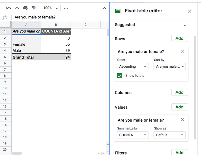
The same column is put into “Rows” and “Values” to get a count of the number of responses in each category.
This video shows all the steps:
5. Save this pivot table to submit later. If you are working in Google Sheets, save an exported file to submit by going to File > Download As > Microsoft Excel.
Part 2: Major League Baseball Salaries
1. Lahman’s Baseball Database is a fantastic resource for Major League Baseball data. This is a project by reporter Sean Lahman, who started his website way back in 1995 and is known for bringing data into sports reporting. He has all his data formatted in clean, helpful ways, which makes it much easier to work with. Download this one salaries file from the 2018 baseball database: Salaries.csv
CSV stands for “comma-separated values” and is a popular data format since it can be imported into a lot of different software programs.
2. Create a new file in Google Sheets or Excel and import the CSV file so we can create pivot tables. You’ll see there are a lot of rows — more than 25,000! For each record we have the year, the team, the league, the specific player and the salary amount.
3. Highlight the entire sheet, then create a new pivot table that shows the average salary each year for the American League and National League. The pivot table options should look like this, except that you want to discover the average rather than the sum:
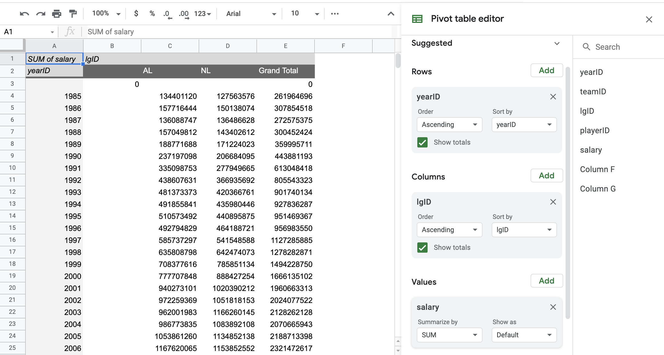
Your pivot table options should look very similar to this, except that this shows the sum of all salaries (to avoid giving away the answers) and you should display the average salary instead for each league and year.
And this video shows the whole process:
That’s all you need to do, but there’s a lot more you can explore in this dataset! For instance, here’s a chart showing the total salaries paid by individual teams. (The Yankees are the green line way above everyone else, and the Dodgers are the orange.)
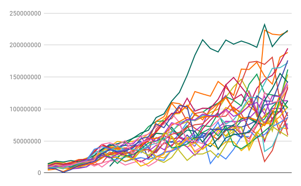
This chart is not understandable as-is. It would need a title and other labels to make sense to anyone who wasn’t already looking at this data. But this can be a great way to quickly look for trends or outliers.
Part 3: Starbucks customer survey in Malaysia
1. This dataset is from a small 2019 market research survey of Starbucks customers in Malaysia. (This data is from Kaggle, a Google hub for sharing datasets.) It includes a variety of standard customer satisfaction questions. Download the file here: Starbucks-Malaysia-survey.csv
2. Like before, create a new file in Google Sheets or Excel and import the CSV file so we can create pivot tables. With 122 responses, it’s not a huge survey, and you could look through the raw data for insights — but we’ll be able to do it more quickly with pivot tables. Look at the header row to see what questions were included on the survey.
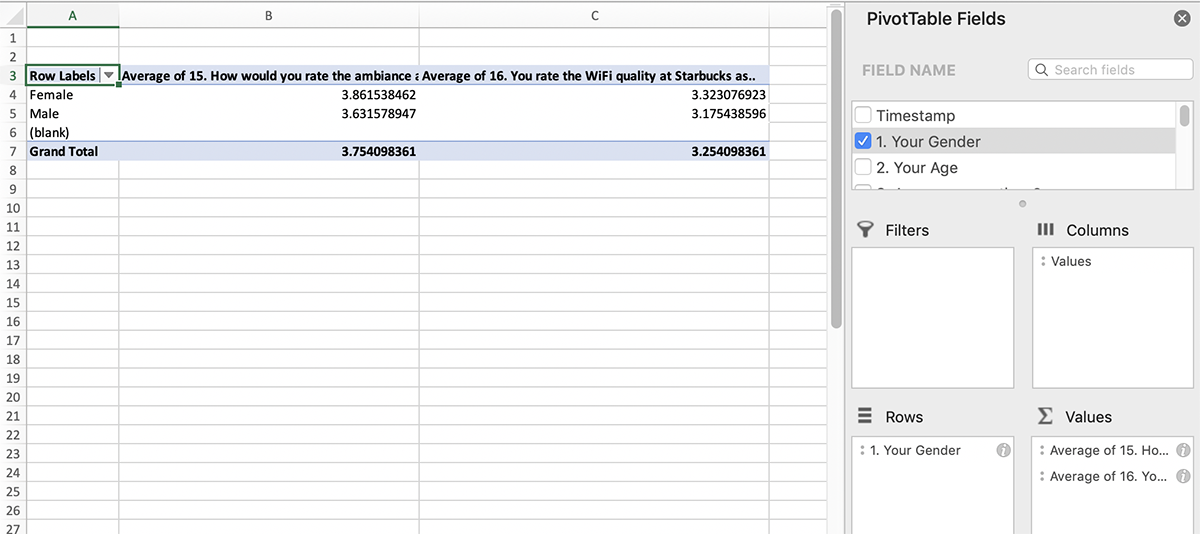
3. Suppose you’re doing a quick analysis about what customers think of Starbucks amenities as part of a consulting project about store renovations. Highlight the entire sheet, then create a new pivot table that shows the average rating for Question 15 (“How would you rate the ambience?”) and Question 16 (“How would you rate the WiFi quality?”) broken out by gender. Here’s what it should look like:
This is in Excel, just to show how the interface is slightly different.
4. Within the pivot table, we can filter to only see responses from customers who frequently go to Starbucks. Question 5 asks about how often survey respondents go to Starbucks. Add Question 5 as a filter, then use the filter dropdown at the top of the spreadsheet to only include people who said they go to Starbucks daily, weekly or monthly (uncheck rarely and never).
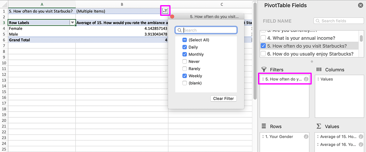
Here’s where to add the filter options in Excel.
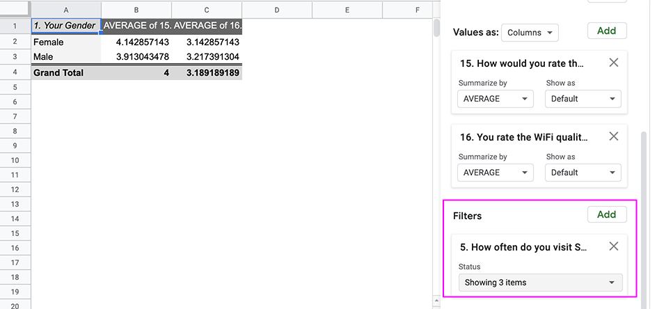
Here is the same thing in Google Sheets — note that the filter option is part of the editor sidebar instead of the top.
Like before, save the file. Surveys don’t always give clear answers, and a pivot table like this might be used to write follow-up questions for a focus group.
Submitting your assignment
Include the following as attachments with your submission:
- Spreadsheet from Part 1 (survey data) showing pivot table
- Spreadsheet from Part 2 (baseball salaries) showing pivot table
- Spreadsheet from Part 3 (Starbucks survey) showing filtered pivot table