
Discussion Review: “Colours in Cultures”
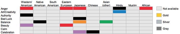
All of you expressed some skepticism about the “Colours in Culture” visualization by David McCandless in discussion before the midterm presentations. If you have time, this paper by Stephen Few dissects that visualization on pages 5-7, including a non-circular remake to show how much easier it is to look up information in a “boring” table. He also questions the oversimplification of the color designations, which is the main thing that bothers me — how informative can this chart really be if it has a single category for “Native American” as if it’s one homogeneous group?
At the same time, I think it’s good to recognize that there are sometimes reasons why an unusual or initially confusing chart can successfully make people more curious about a topic. One designer I admire for taking the “information is beautiful” ideas to the next level is Federica Fragapane, who presents data with organic-looking shapes that require viewers to learn the symbolic marks fresh every time. That’s asking a lot of viewers, but it’s powerful when done well, similar to how people will put in the effort to read a well-crafted poem or novel.
Key Concept: Why Map Projections Matter
Today we’re continuing with cartography and mapping, with a focus on clarifying a few important concepts. The following two videos do a good job explaining map projections and why there’s no perfect solution.
1. First, here is a 2-minute video from National Geographic — it’s aimed at elementary school kids, but that makes it a good introduction. To access the video, go to the main lesson page and select the video listed second in the content slider. It’s called “The Cartographer’s Dilemma.”
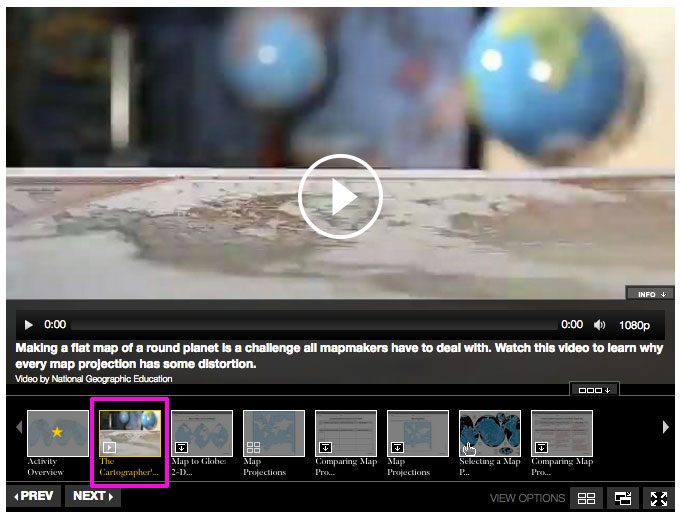
To access the video, go to the main lesson page and select the second item in the slider.
2. Next, watch this 6-minute video from Vox that goes into a little more depth about how some of the more popular projections developed and what trade-offs they make.
Spatial Data: Maps?
Along with the maps we see frequently, such as maps of the U.S. or world, data visualization makes use of other types of spatial data that can be considered a type of mapping. A classic example is the X’s and O’s on a diagram showing a football play – this is not exactly geographic data since it could apply to any football field anywhere, rather than specific coordinates on the Earth, but it follows the same rules of using symbols and scale to represent the physical location of things.
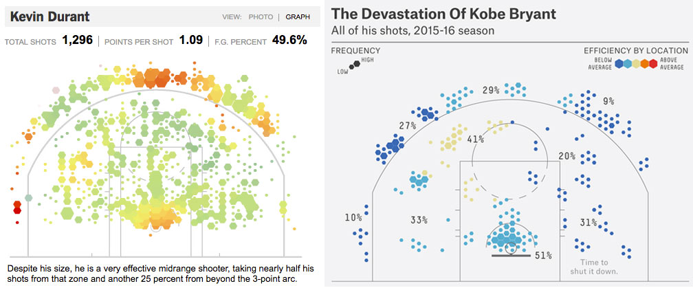
Above are two graphics published by The New York Times in 2012 (left) and FiveThirtyEight in 2015 (right) about where basketball players take shots on the court, along with the success rate. Both of these can be considered maps even though they combine data from many different basketball courts where games were played, rather than one location on earth. In fact, since these charts were published, mapping shots has become a lot more common, and at least one ESPN analyst thinks this type of visualization is permanently changing strategy in professional basketball.
Not Maps
Some types of charts include the word “map” even though they’re not really maps. Despite their names, heat maps (or heatmaps) and tree maps have nothing to do with geography.
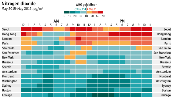
Heat maps use color to represent variables and show relationships in a grid format. This example is from The Economist.
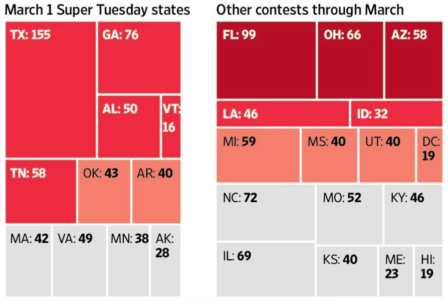
Tree maps use proportionally sized rectangles to show hierarchy and relative size. They are more similar to organizational charts and pie charts than geographic maps. This example is from The Wall Street Journal.
Heat maps in particular are often combined with actual maps, which makes things especially confusing. If you combine a heat map with a geographic map by using color to represent values for geographic areas, that’s the ever-popular choropleth map that we saw in the lecture slides.
Readings
• ‘X’ Marks the Spot: Officials Map a Route Out of the Pandemic (NYT) PDF version
• Mapping the Future: Cartography Stages a Comeback (Wired) PDF version
You can click the links for the articles as published, or read the PDF version instead. PDFs are available because these articles sometimes don’t load correctly.
Discussion
Following up from the previous lesson’s information about classifying map types, we’ll look at a handful of examples to try to classify them. You’ll be finding your own example, but you can use examples from this list if you’d like.
Categorizing Maps: Find an online map that relates to something in your life, such as a topic you’re interested in or a place you’re familiar with. Some of them may not fit neatly into certain categories, so just explain your thinking if you’re not sure.
- What does the map show or communicate?
- Is it a reference map or thematic map?
- Does it use point, line or area data?
- Is data shown with size, shape, pattern, hue, value or some combination?
Assignment 15: Making a Cartogram
In this assignment, you’ll use Google Trends data to create a cartogram in Adobe Illustrator.