
Reviewing Data Dimensions
As we talk about interactivity, it’s a good time to review the concept of visual encoding, which is about how visual symbols are used to represent data. Early on, we looked at four basic types: shape, line, point/position and color. We’ve seen many ways these can be combined and used to represent data. A related concept is data dimensions, which has also come up in several examples and talks. A practical way to think of data dimensions is with the columns in a spreadsheet — can you represent multiple columns with a single chart? That means it has multiple data dimensions.
For instance, scatterplots are known for being multidimensional. Take this New York Times scatterplot from the reading about geographic data without maps.
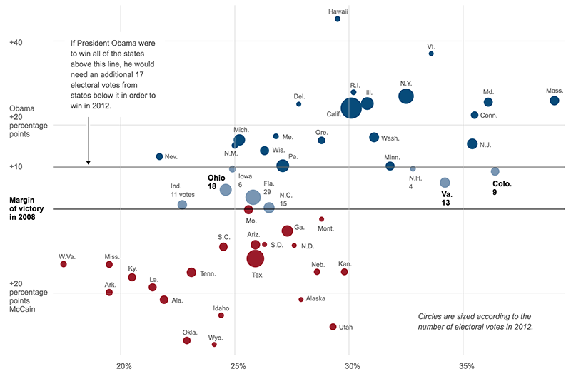
This is point data, with a point for each state. But there are multiple dimensions:
- Y-axis shows how a state voted in the 2008 election
- X-axis shows how educated the residents are
- Color represents three categories for Electoral College thresholds
- Size of each bubble represents number of electoral votes
So how does this all relate to interactive graphics? Interactivity makes it possible to have additional data dimensions, and motion is an especially valuable tool. We’ll see that in the following videos.
Presentation: Global Health Storytelling
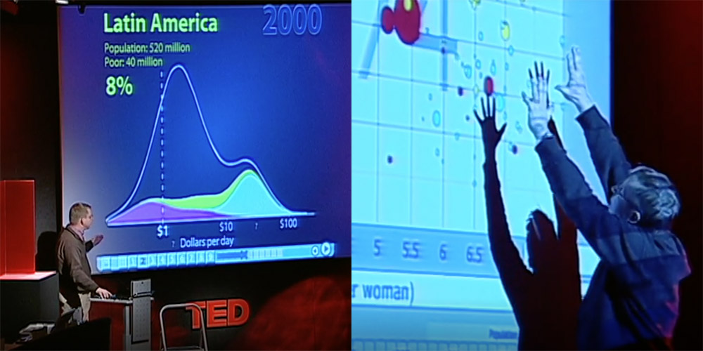
Start by watching this video of Hans Rosling, which is part of a BBC program called “The Joy of Stats.”
Rosling was a Swedish statistician and public health advocate; his death in 2017 was a big loss for the data vis community. This video is kind of a classic for showing how data visualization can tell a story in a way that differs from other times you’ve learned about world history. Rosling is not especially concerned about questions of style and design. His interest in data visualization is that it’s an effective way to communicate with people, especially about ways that the world is changing.
Next, here is his longer TED Talk (watch until at least 15:00): The Best Stats You’ve Never Seen
Readings
• Patterns for Humane Data Visualization (Source)
• Human-Looking Data Visualizations Don’t Boost Empathy — Yet
One criticism of data is that it can seem impersonal or doesn’t evoke emotion that way other forms of storytelling can. These readings present two different perspectives on the topic of humanizing data visualization and whether it can be done effectively.
Discussion
This question is related to the topic from the two readings described above.
Humanizing Data: Data about people can seem impersonal or unemotional. Some practitioners say using human shapes, interactivity, annotation or other methods can help, though some research indicates common tactics may be limited.
- What do you personally think is effective for making data visualization about people feel compassionate and emotionally compelling?
- What is one example of a visualization you’ve seen in this course or your own experience that evoked emotion when you first saw it, and how did it do that? (It doesn’t necessarily need to be a big emotion, just some type of emotional reaction.)
Assignment
There is only one assignment this week.