
Installing Tableau Public
 Next week we’ll start using Tableau Public, the free version of the popular data visualization software. It allows you to create interactive charts, add multiple charts to a single “dashboard,” and publish your work online. There will be download instructions in the first Tableau assignment, but I’d highly recommend trying to download it right away since issues come up fairly often.
Download and install Tableau Public to your computer: https://www.tableau.com/products/public/download
(Make sure to choose Tableau Public, not Tableau Desktop. It can take a while…)
If your operating system is out of date, you may not be able to download the program. You can see the full tech specs and requirements here. If you are not able to install Tableau on your computer or update your operating system (which is almost always free for security reasons), please get in touch and we can figure out a solution.
The installation of Tableau Public is a pain compared to other companies’ browser-based visualization software, so it was exciting last year when Tableau announced you can now create visualizations online without having the software on your computer. This is in beta and doesn’t have every feature of the full program, so we’re going to stick with the downloaded software for training assignments in this class. But you’re welcome to try out the browser version if you want! It may work well for personal projects later in the course.
Lecture: Practical Design Tips
Visualizing data requires making many graphic design choices about the arrangement, color, shapes and text in your charts. This lecture shows some general guidelines you can use for making visually appealing charts.
Video not showing up? Watch on YouTube here.
Here’s a summary for easy reference in question format:
Grid
- Is there visual hierarchy to guide the viewer?
- Is the space organized with elements aligned?
- Are important elements labeled and where viewers expect them to be? (Where’s the bathroom?)
Type
- Are you using one font, or two at most?
- Did you avoid italics and all caps?
- Tip: When in doubt, stick to Georgia, Arial and Helvetica
Line/Shape
- Does the chart make use of pleasing shapes like circles and squares, rather than awkward shapes like ovals?
- Are lines no thicker or darker than necessary?
Color
- Have you avoided contrasting red and green?
- Is the text black, gray or white, rather than a color?
- Tip: When in doubt, stick to the black-white spectrum with one accent color
Discussion
Time to sketch again! A lot of examples we’ve discussed have pretty heavy topics — death, disease, economics, climate — but visualizations can also be personal, funny and conversational. For example, Dear Data is a pen pal project by two visual designers to document mundane aspects of their lives, often with unusual chart forms. Michelle Rial is a designer who makes humorous charts, often with objects or textures. Ann Friedman is known for doing funny pie charts.
Charts can show commentary or opinion, just like text. This Wall Street Journal chart stood out last year — we’ll see if they publish an update this year.
Personal Sketch Chart: Draw a visualization that represents something about you or your personal experiences that makes use of numerical data. Use data visualization to tell us something interesting, unexpected or relatable about yourself.
- It can be accurate data, estimated data, or more expressive data used to make a point.
- There should be a title and enough labels to understand what the chart is showing.
- Include the image directly in your discussion response with 1-2 sentences to elaborate on your idea and what we should get from it.
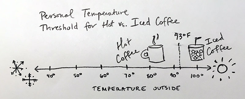
For example, I’m curious about when people decide to drink iced coffee vs. hot coffee. I’ve even bothered friends who work in coffee shops about whether they keep track of this in some way. Is it the weather? The time of year? The time of day? For myself, though, it’s very clear: I only drink iced coffee when it’s more than 93 degrees outside. I just like it hot.
Assignment 6: WSU Tuition: Organizing Data
In this assignment, we’ll again be using WSU Institutional Research data to look at tuition trends going back to 1970.
I promise we’ll move on from WSU data soon! But it’s a great place to start since you’re familiar with how WSU works. It’s also a useful example for the value of data visualization, because most people haven’t seen a chart of tuition costs even though tuition rates are always newsworthy. Later, you’ll create a set of charts in Tableau using this tuition data.