
Warm-Up
To get started, take a look at these two projects about world population:
- Human Population Through Time (video to watch; 6 min.)
- World Population History (click “Explore the Map,” explore for at least 3-4 min.)
They have very similar topics and information, but presented in different ways. The video gives you less control, and requires less effort on your part. The interactive map/timeline gives you more control, but also forces you to interact to get any information. Keep these two examples in mind during the lecture.
Lecture: Guided vs. Exploratory Graphics
A benefit of interactive graphics is that they allow viewers to explore or control the data to some extent. Think of interactive experiences in the real world, such as visiting a new city for the first time. Are you someone who likes to read books and Yelp reviews and sign up for guided tours? Or are you someone who likes to just go out and see what you find? Maybe a little of both? Along with personal preference, it might depend on how much time you have or how comfortable you feel in that place. Interactive graphics are a lot the same way.
Follow along with the slides here: Guided vs. Exploratory Graphics
Video not showing up? Watch on YouTube here.
A key idea is that a single interactive graphic can be both exploratory and guided. This is a popular approach for complicated topics — a few steps guide the viewer into understanding the information and chart type, and then the viewer is let loose to explore however they want. (This is also popular when traveling, to revisit that analogy — you might take a guided tour or rely on a friend the first day of your trip, then explore on your own once you feel more comfortable.)
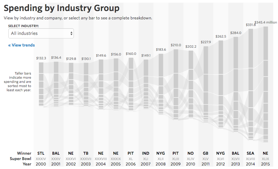
The Wall Street Journal graphic about ad spending above is a great guided and exploratory example. What is interesting about this chart? What’s the story here? Most viewers probably wouldn’t be able to understand immediately, so a few trends are highlighted in a stepper format to get you started.
Readings
• Three Ways to Annotate your Graphs
Discussion
The importance of communicating accurate health information during the coronavirus pandemic has led to a variety of widespread visualizations, from serious charts showing predicted deaths to often-silly social media images showing people how to imagine 6 feet for social distancing.


Visualizing the Pandemic: Think for a minute or two about the various data visualizations you’ve seen related to the pandemic since early 2020.
- What visualization(s) will you look back on as distinctly related to the pandemic?
- Have you personally found visualizations useful for being more informed during the pandemic, or have you found other forms of information more useful?
- Do you think humor and goofiness is appropriate during a pandemic? How should communications professionals balance seriousness with fun?
Assignment
In this week’s assignment, you will create slides with charts communicating recent opinion poll data. This assignment is intentionally open-ended with a lot of freedom to choose the tools and software you prefer. The goal is that you will have experience with a project from beginning to end before starting the final project.