Review: Visualizing the Syllabus
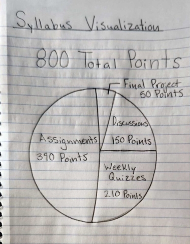
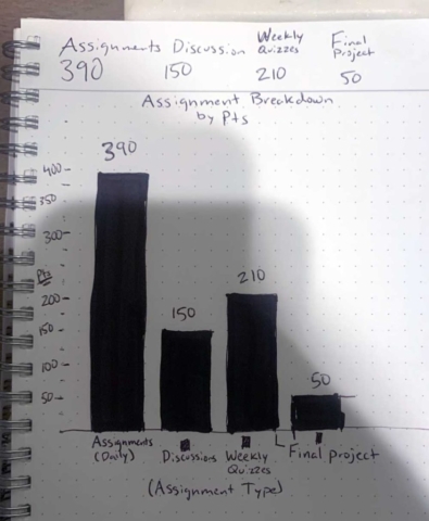
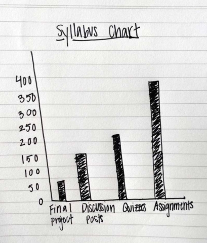
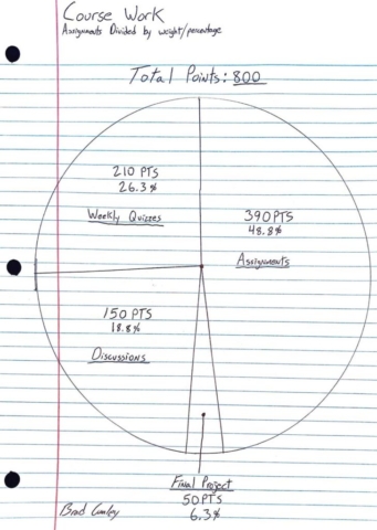
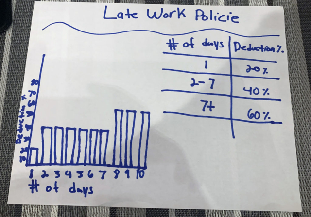
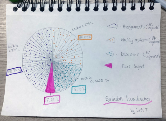
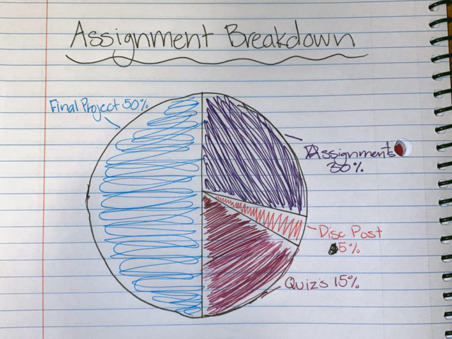
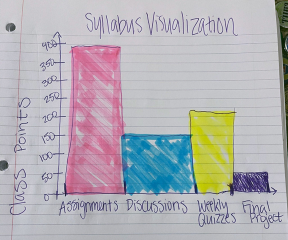
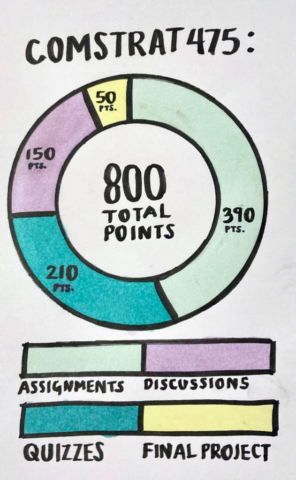
So, admittedly the syllabus visualization from the first week of class is mostly just to make sure you look at the syllabus. But it’s also a good sketching warmup and a chance to talk about charting choices! Here are the charts, along with a few from previous semesters:
We’ve got a lot of pie charts and a few bar charts, and both are good choices for this data. We’ve also got a line chart, a pictogram and a few other formats, which are also good. Pie charts work well for visualizing point totals since it’s showing how a “whole” is split into parts. Even with the same chart types, there are differences in titles, labels, keys, colors and other design elements. You may have put quite a bit of thought into that, or maybe not — either way you’re making design decisions, and we’ll spend more time on that soon.
Lecture: Elements of Data Visualizations
In this lesson you get a break from my voice and slides, and we’ll instead hear from Prof. Alberto Cairo, who teaches at the University of Miami and is well-known and respected in data visualization, especially at the intersection of news graphics and academic research.
This video is from a MOOC (massive open online course) that he taught for the Knight Center for Journalism in the Americas. Last week we went over visual encoding, which is about representing data visually using symbols such as color or shape. In this 10-minute video, he includes encoding as one of three elements required for a complete visualization.
Video not showing up? Watch on YouTube here.
Readings
• Data + Design Chapter 4 (we’re skipping some chapters, including Chapter 3, but of course you’re welcome to read it if you want)
• Visualization: Encoding Data Using Visual Cues
Discussion
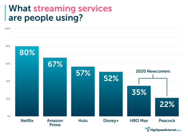
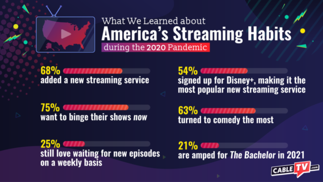
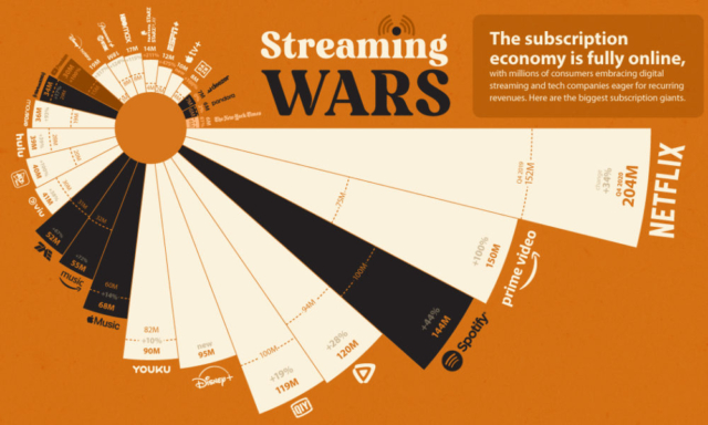
As online video streaming services have become more popular, there has also been growing interest in quantifying the competition and differences between services. We’re going to take a look at a small collection of related charts published in the past year.
Streaming Services Chart Comparison: Look carefully through the following charts about this topic:
- Which one do you think looks the best and why? (Colors, fonts, overall design, etc.)
- Which one do you think shows the best information and why?
- Optional: If you use a streaming service, do you have any recommendations about shows or movies you’ve enjoyed recently?
Assignment 4: Pivot Tables
In this assignment, you’ll use pivot tables in Excel or Google Sheets to find patterns and trends in large datasets. Pivot tables are a basic but powerful tool for aggregating large datasets to easily find insights.

