Review: Food Consumption Pictograms
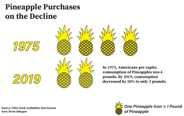
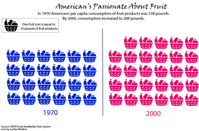
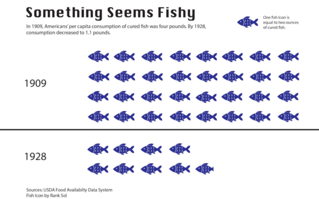
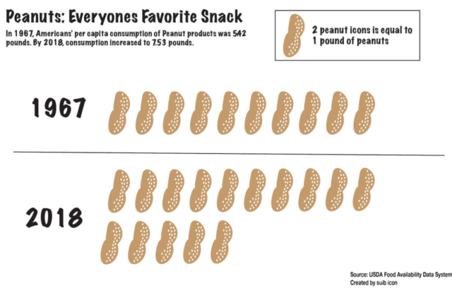
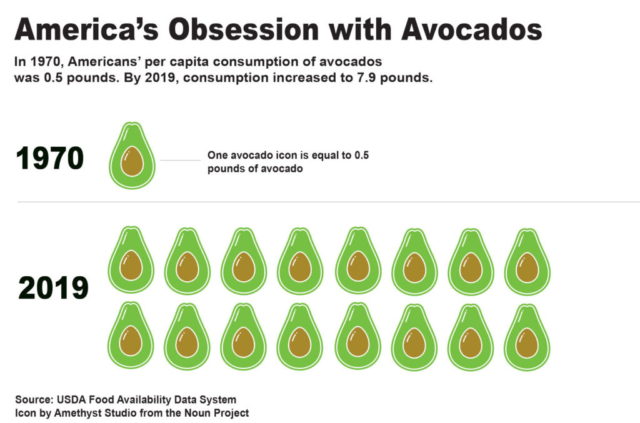
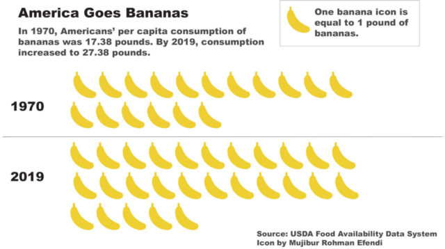
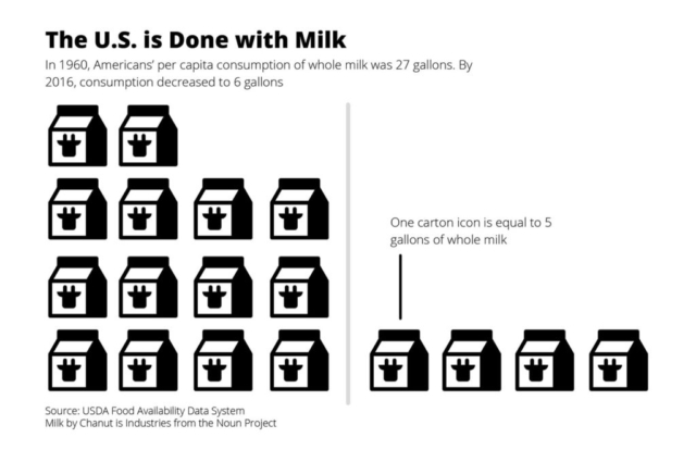
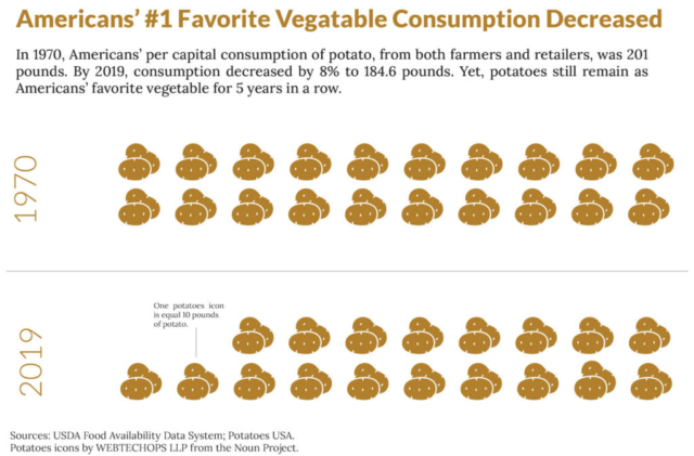
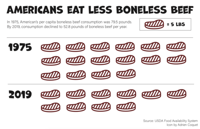
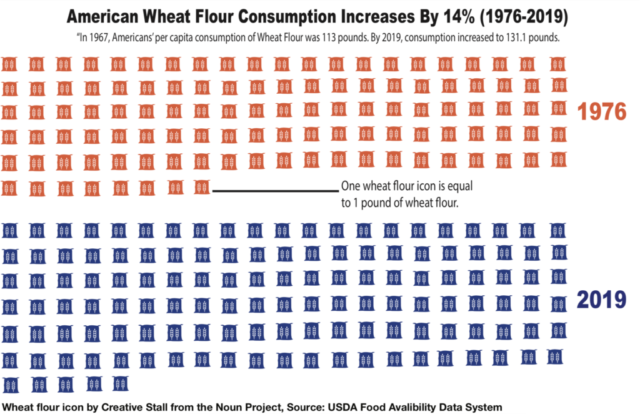
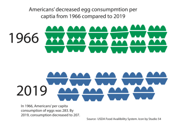
I always enjoy seeing how the pictograms turn out! Here are the ones you made, and some from last summer’s class, so you can see the different foods and styles:
Lesson: Chart Variations and Tree Diagrams
Beyond the common chart forms are many others that use the same visual encoding symbols in different ways. Now that we’ve encountered — and made! — a wide variety of graphics, it’s a good time to review common chart forms, explore variations on the basics, and examine the family of tree diagrams that show connections and hierarchy.
Follow along with the slides here: Classifying chart types
Video not showing up? Watch on YouTube here.
Reading
• Interview with the South China Morning Post Infographics Team
The South China Morning Post graphics team is known for doing impressive and creative work that often heavily uses hand-drawn illustrations and blends different visual formats. This recent interview includes sketches showing how they plan, and describes how they take on large stories with a relatively small team.
Data Visualization Taxonomies
People who are interested in data visualization love to classify and visualize visualizations. A taxonomy is a system for classifying things within categories. You may remember taxonomies from biology class, and you’d be correct if you were thinking that sounds a lot like what tree diagrams can visualize well.
Browse the following collections and taxonomies to get a sense of how data visualization practitioners attempt to classify and organize the many types of visualizations:
- Taxonomy of Chart Types
- Flowchart Poster by Andrew Abela
- The Data Visualization Catalogue
- Data Viz Project
- Financial Times Visual Vocabulary
- Introduction to Data Visualization: Visualization Types
- Chart Chooser cards
These have similar goals, but with many differences. Which of these seems most useful to you? Do you see any discrepancies, like the same chart with different names?
Discussion
After looking through the various taxonomies listed above, choose one chart type that stands out to you.
Lesser-Known Charts: Write about the following:
- Choose an unusual chart type from one of the taxonomy lists and briefly describe what it’s called and what it’s used for.
- Is it similar or related to any other chart types?
- Is it on multiple lists, and is it sometimes called by different names?
- Is this a chart type you would personally use for any reason?
- Include an example image of what it looks like.
Assignment 17: Youth Sports Infographics
In this assignment, you’ll look at a long report about youth sports participation and use it to create several graphics suitable for sharing on social media.

