
Fabulous Chartjunk!
The chartjunk charts you made are too amazing not to share. I especially like how there are different approaches — some include distortion and dizzying color choices, while others are all about different types of distraction. All obscure the data well! Which is, of course, not usually the goal, and I think a few of you found it difficult to be completely unrestrained. But great examples of the concept. (I’m including a few favorites from previous semesters, too.)


The good charts were also done well. One aspect that’s hard to show with the chart on its own is the size, but here’s my example of how this data could be displayed very simply in a very small format. This is done in Illustrator.
Presentation: “Information is Beautiful”
After looking at Edward Tufte’s principles, today we’ll hear from David McCandless, who’s known for his blog and other work under the “Information is Beautiful” brand.
Video not showing up? Watch on TED here.
Comparing Different Design Perspectives
McCandless describes himself as a data journalist, though some people disagree with this because he is sometimes criticized for prioritizing design over accuracy and thoroughness. His ideas are sometimes put in opposition to Tufte’s, since he celebrates unusual chart types, colorful designs and other style choices that Tufte might dismiss as chartjunk. McCandless is known for making work that is visually striking and eye-catching, which is why his visualizations are so popular and why they get criticized.
One of the most vocal critics of McCandless is Stephen Few (the author of the pie chart PDF reading), who has written:
Too many of his visualizations display information in ways that hide much that’s relevant and essential, leaving little of value for the viewer to see. McCandless rarely chooses forms of display that our eyes and brains can perceive with ease and precision. He selects what will appeal superficially to the viewer (lots of circles, swirls, and vibrant colors), not what will most effectively express what’s essential and meaningful. His displays rarely draw viewers into the data in a thoughtful way, but entertain in a way that delivers a simple message, which is often anemic when compared to the richer, subtler, and more complex stories that live in the data.
Few is mostly aligned with Tufte’s principles, but known for being more of an absolutist about the function of charts. He is sometimes criticized for being no fun. We’ll continue to look at other perspectives throughout the course.
Readings
• “What We Talk About When We Talk about Beautiful Data Visualizations,” a book chapter from Data Visualizations in Society
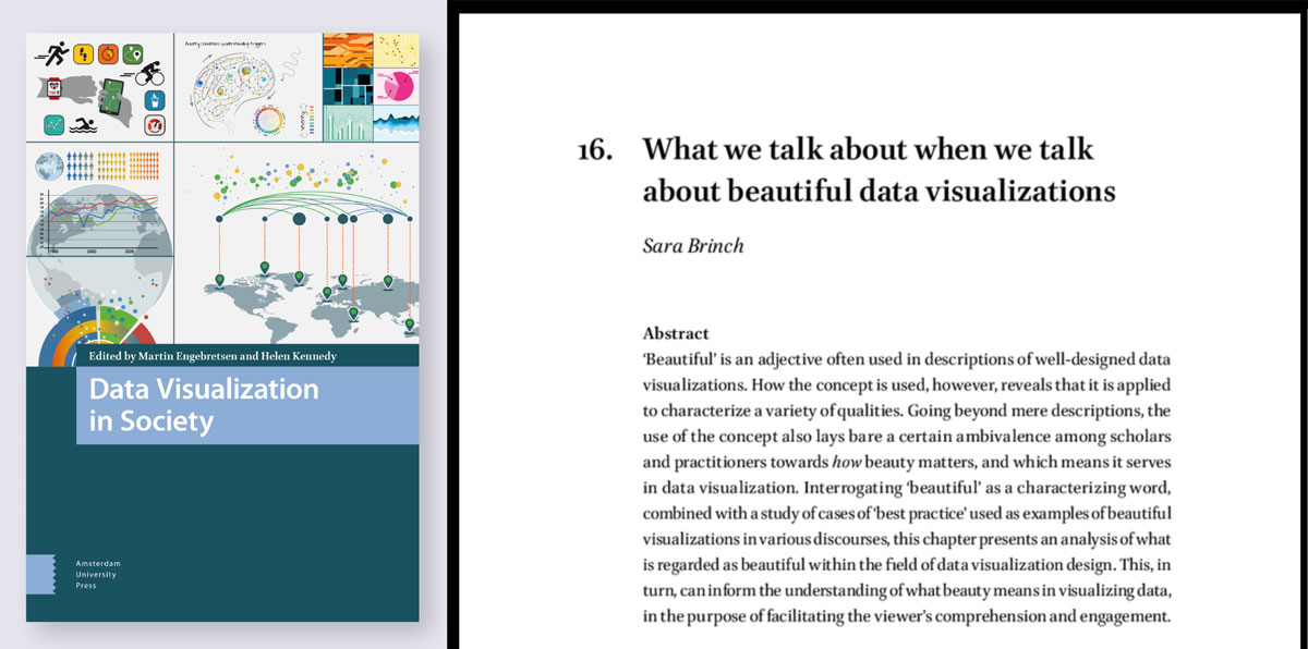
This reading is a chapter from an academic book and written in the style of a research paper. It is a more challenging reading level than many of our other readings, with dense citations and references to many modern practitioners whose names you may recognize from previous lessons.
To get the most from the reading, I would recommend printing the available PDF so you can add notes as you read, and pause to look up at least 3-4 examples or terms on each page. It can also be helpful to read it aloud.
Discussion
Let’s talk a little about different opinions on what makes a “good” chart, in general and then specifically with this well-known McCandless visualization about cultural meanings of colors.
Design Perspectives: View the “Colours in Cultures” visualization and then respond to these questions.
- Overall, do you agree more with Tufte or more with McCandless in their approaches to data visualization?
- What goals do you think matter most when designing visualizations? (Accuracy? Catching attention? Quick to understand?)
- On a scale of 1-5 stars (5 is best), what is your rating for the “Colours in Culture” visualization and why?
Assignment 11: Midterm Comparison Project
This project is a break from our regular hands-on assignments to pause and apply concepts from this course so far in a comparison of professional examples. This week has this one larger assignment instead of two smaller ones.