
A Note about the Earth temperature discussion
All of you looked at various Earth temperature graphics and made good points about your own preferences and which one Edward Tufte would like best. Although they take somewhat different approaches, I think you’re absolutely right that Tufte would approve of the Bloomberg charts with data density and overall clarity.
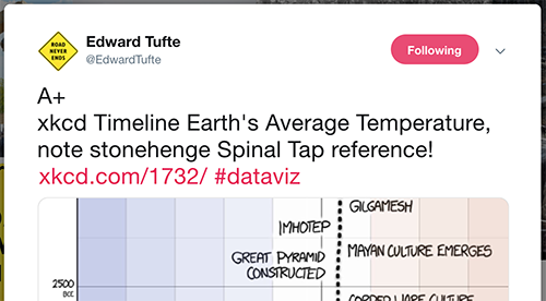
But, as it turns out, Tufte is also a fan of the xkcd illustrated graphic — he shared it on Twitter with and “A+” comment, which is basically his highest praise. As some of you noted, it takes a while to get to its point. It is not a good example of data density. So this is mostly a lesson that storytelling and unusual ways of presenting data can also be effective, and sometimes have an impact on people that a more typical chart designed for data density cannot. Tufte sometimes get criticized for going against his own design principles, but I think it’s admirable that he’s not an absolutist. A poem, a news article and a legal document can all be well-written without being anything alike, and visualizations can similarly have different purposes, even on the same topic.
Lecture: All About Pie Charts
Pie charts are a beloved, familiar chart for many people. But they’re also derided by experts. So what’s wrong with them? Today we’re talking about what makes pie charts uniquely effective in very specific circumstances.
Follow along with the slides here (first half): All About Pie Charts
Video not showing up? Watch on YouTube here.
Readings
• “Understanding Pie Charts” (EagerEyes)
• “Save the Pies for Dessert” (Stephen Few)
Discussion
Lego Pie Charts: This series of pie charts shows how the colors in Lego sets have changed over time. Lego is fortunate to have strong brand loyalty among adults as well as children, and this chart has been widely shared online among Lego enthusiasts. Consider this example and whether you think it works or not.
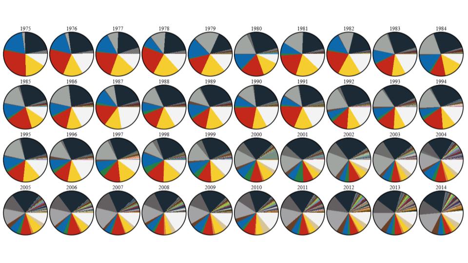
- What was your first impression? Do you like it as a chart?
- Is there anything you would change about it, like recommending a different style or chart type?
Assignment 9: Making Dashboards in Tableau
In this assignment, you’ll use the charts you previously created in Tableau and combine them into a single page, which Tableau calls a “dashboard.” This is the final assignment in this three-part project using WSU tuition data to introduce Tableau.