
In this assignment, you will use U.S. Census data about state statistics to create interactive maps using two different tools.
Getting Census Data
The U.S. Census Bureau is an important source of data at the national, state and local level in the United States. There is a census of all people in the U.S. every 10 years, which is mandated by the Constitution. But the Census Bureau is also responsible for a number of other surveys and information, including the American Community Survey.
Census Reporter is an independent project for making U.S. Census data easier for journalists to browse and use. This assignment will use data downloaded from Census Reporter and mapped with Datawrapper and Flourish.
1. Browse Census Reporter to download a dataset.
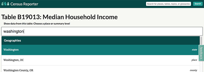
- Go to the Census Reporter page for income data: censusreporter.org/topics/income
- Click on a code number for the data table you want to use. The instructions will use “Median Household Income” and you can choose that, or you can pick a different one.
- In the box that prompts you to type a location, start typing any state name and then select it. This will display the data for that state.
- To add all the other states, look for the “Add all states in…” link on the left and choose all of the U.S. states.
Start typing any state name, and make sure to choose the option labeled “state” over on the right in italics.
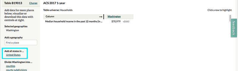
This allows you to quickly add the exact same information for all other states.
2. As long as all 50 states are included in your data table, you can now download the data.
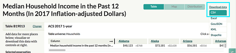
- Click the download link in the top right and choose CSV.
- This will download a zip folder to your computer. Unzip the folder to extract the CSV file. You can rename it to a more descriptive name if you want.
CSV is a structured text file that we’re using in this instance because it’s accepted by all the different tools we want to use. It’s worth noting that one of the tools, Flourish, also accepts GeoJSON, which eliminates the step of matching up the geographies.
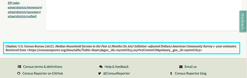
3. Don’t leave Census Reporter quite yet! If you scroll to the bottom of the page with the data you just downloaded, there is citation information that includes the precise description of this data. You’ll use this for your interactive maps, so either copy the citation or leave this page open.
This tutorial video shows the process for downloading data and initial steps for creating a map:
Making Interactive Maps
Now, display the income data on an interactive map. We’ll be using two web tools. They are free, but you will need to sign up for an account to save and submit your work:
- Flourish: flourish.studio
- Datawrapper: www.datawrapper.de
Both maps will display the same information, and you can make them in any order. Tips for each one are included below, but you are welcome to just try out the tools and see what happens.
For both, make sure each map includes:
- A sequential color scale other than the default colors
- A descriptive headline that explains what is being shown
- The state name and the amount with a $ when you hover
- A subhead or text description pointing out an interesting fact (such as the highest or lowest, or how Washington compares).
- A data source that includes the full citation from Census Reporter
Flourish
1. Choose the template for US (states).
2. Make the Points Layer “disabled” to hide the unnecessary point data.
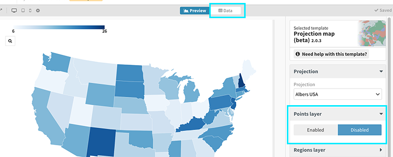
The Points Layer could of course be useful for other purposes, but we don’t have any relevant point data at the moment.
3. Click the Data tab at the top and import your CSV file.
• Choose the option to Merge with current sheet to maintain the state shapes and Import Publicly.
• For the merge, select the columns that include state names.
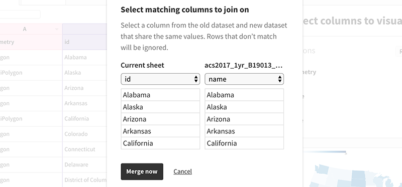
The goal for merging is finding two columns with the same information so it’s clear how the other information should match up.
4. For the map “Value” field, choose the column that represents the data you want to display. If you are using Median Household Income, for instance, it needs to be the column with values roughly in the 40,000-80,000 range.
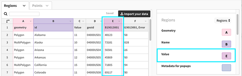
Make sure the “Value” field has the correct column for the information you want the map to display.
5. Click the “Preview” tab at the top to go back to your map and style it.
• Look under Regions Layer to customize colors, style the numbers (add $ sign), and more.
• Look under Layout to change the font and background color if you want.
• Look under Header and Footer to add all the necessary text and source information. Note that changing the “Untitled” text in the top left is different from adding a title that will display on the actual map.
6. Publish to get the link for submitting.
Datawrapper
1. Start a new map, then choose Choropleth and USA » States.
2. Scroll to the bottom of the page and click Import your dataset.
• Click the text link to import a CSV file.
• The correct column should match automatically — if the second column has the state names, for instance, then the second callout rectangle should be blue.
• Do the same thing for selecting which column has the data you want to display.
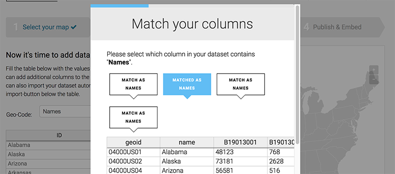
The two stacked callout rectangles is a design flaw — there is one rectangle for each column, so the fourth one should be over on the right instead of stacked below.
3. When your map is color-coded correctly, click the Visualize arrow above the map or the “Proceed” button at the very button to move on.
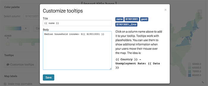
• Under Refine, change the colors, customize the tooltip hover information, and more.
• Under Annotate, add all the necessary text and source information.
You can add any text or labels you want to contextualize the spreadsheet information.
4. Publish to get the link for submitting.
Comparing Tools
Answer the following questions in a text document:
1. Which tool did you like better for making the map, and why?
2. Which tool had the best final product from the perspective of someone viewing the map, and why?
4. Do you think this type of low-level interactivity on a map is useful?
Extra Credit Opportunity!
You can also make this same map in Tableau Public for 5 extra credit points. This is not required. Follow the same instructions using your knowledge of Tableau.
A couple of tips:
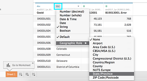
• Choose a “Text” data source for CSV files.
• Tableau may not recognize the states column as geographic data when you first import. Click the little icon in the top left of that column header and assign the correct geographic role.
• Remember to customize the Tooltip settings to change the hover information.
Submitting Your Work
Complete your assignment by submitting the following materials to Blackboard:
- Link for published Datawrapper map
- Link for published Flourish map
- Text document with written responses
- Optional for extra credit: Tableau map link
Please double-check your links in a different web browser or when you are not logged in to make sure they are published publicly!