
In this assignment, you’ll map liquor licenses for the entire state. Instead of using point data to represent the location of every establishment licensed to sell alcohol, we’ll aggregate the data by county and create a choropleth map.
Note that this is assignment is split into two parts to make it easier to split up the work throughout the week. However, you will submit the materials together as one assignment.
Part 1: Organizing the Data
1. You’re going to be collecting several files for this assignment, so it’s a good idea to create an assignment folder where you can keep all the raw data.
2. First, we need the list of all establishments licensed to serve alcohol in Washington state. The Washington State Liquor and Cannabis Board maintains this information and regularly publishes an Excel file with all licenses. (This is the same data we used in the previous assignment, but this time we’ll be using the full spreadsheet provided by the state agency, and only for on-premise licenses.)
Download the spreadsheet called “On-Premises Licensees” from the WSLCB Frequently Requested Lists page: http://lcb.wa.gov/records/frequently-requested-lists
The Washington State Liquor and Cannabis Board publishes a number of frequently updated lists and datasets.
3. Open the spreadsheet in Google spreadsheets or Excel. (These instructions will show Google spreadsheets, but either one should work similarly.) Scroll down and note that there are a lot of rows.
4. Some businesses have multiple licenses, but we only want to show each location once. Going through this spreadsheet to delete duplicates one at a time would be extraordinarily time-consuming. Please do not do this. Instead, we’ll use a formula to identify duplicates and then filter them out.
- Insert a new column to the right of the “License Number” column.
- Give the column a header such as “Duplicate Check.”
- In the first cell, use this conditional formula to check whether the first row has the same license number as the second row:
=if(B2=B3,"Duplicate", "")(This formula assumes the license number is in Column B. If it’s not, change the B’s in the formula to the correct column.) - At first, it may look like nothing happened. But that’s because the cell remains empty as long as the license number is unique (not a duplicate).
- Click on the cell that contains the formula so it appears outlined with a tiny square in the bottom right corner. Double-click that tiny square to make the formula copy all the way down the spreadsheet.
- Scroll down a bit to check that the formula copied correctly. Do you see some cells that say “Duplicate,” and are they in fact duplicates? If so, excellent. We could filter the spreadsheet at this point to remove the duplicates, but it’s not necessary since we’ll be creating a filterable pivot table next.
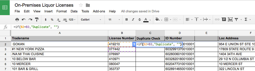
Use an “if” formula to check for duplicate license numbers. Note that the screenshots here are from earlier versions of the data, so what you see should be similar, but may not match exactly.
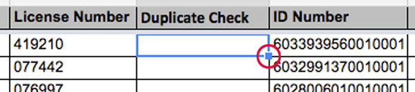
Double-click the little blue square to copy the formula all the way down.
5. Instead of mapping all 10,000 locations, we’re going to show the total number of licensed locations by county. In this step, you’ll create a pivot table to tally this.
- With your full spreadsheet selected, create a new Pivot Table. In Google spreadsheets, go to Data > Pivot Table.
- You may get an error if any of the columns are missing headers. (Check for Column E, which sometimes causes problems.) You can delete any blank columns or add a header label so the pivot table will work.
- Double-check that the range matches up with your entire spreadsheet, then create a pivot table that tallies the number of licensees for each county.
- Once the pivot table is showing the totals for each county, use the filter option in the pivot table settings to filter out the rows labeled “Duplicate.” Make sure you are excluding the ones labeled “Duplicate,” with the checkmark only for the blank rows.
- If all goes well, the total displayed at the bottom should be around 10,000.
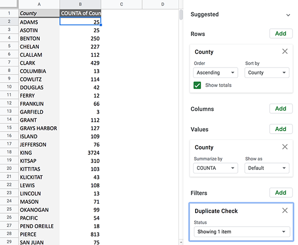
Your pivot table should show all the counties and the total number of licensed establishments in each one, including a filter to keep out the ones labeled as duplicates.
Which county has the most establishments licensed to serve alcohol? The answer shouldn’t be too surprising, because it’s also the county with the most people.
6. Now copy the pivot table data to a new sheet, because we’re going to add a few more columns. To paste it into the new sheet, make sure only the data is transferred (rather than the formatting and pivot table calculations). In Google spreadsheets, paste the data by going to Edit > Paste Special > Paste Values Only.
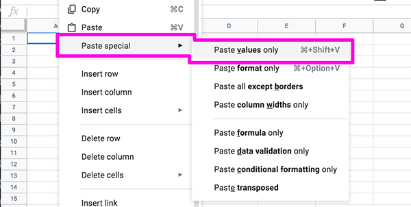
Paste special is helpful if you want to keep the data without the formulas or formatting, or if you need to do other tasks like switch rows and columns.
7. Next, you’ll add county population data to the spreadsheet. The most recent data available is from 2022.
- Label the first open column with the header “2022 Population.”
- The state Office of Financial Management releases population estimates every year on April 1. Visit the OFM website to download the most recent data: http://www.ofm.wa.gov/pop/april1/ (If that link is not working, try this one: https://ofm.wa.gov/washington-data-research/population-demographics/population-estimates/april-1-official-population-estimates)
- Download the Excel file labeled “April 1, 2022 population of cities, towns, and counties used for the allocation of selected state revenues”
- Open the spreadsheet in Excel or Google spreadsheets, and copy the 2021 population number for each county into the corresponding cell on your main spreadsheet. This part is a little tedious.
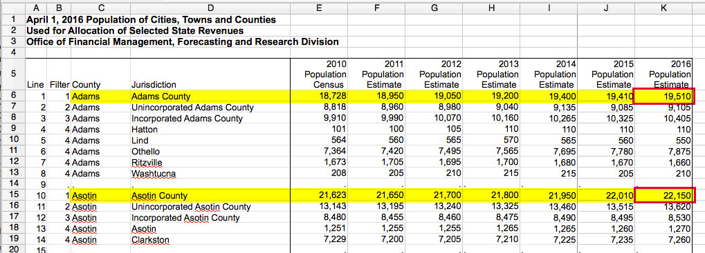
Make sure to copy the most recent population estimate for each county, not one of the smaller jurisdictions within the county. This screenshot shows a previous year, so make sure you get the most recent year.
Take a moment to look through the numbers and appreciate why population is important here. We already saw that King County, where Seattle is located, has the highest number of businesses with liquor licenses. That’s not surprising — it also has tons of people! At the other extreme, Garfield County in southeastern Washington has only 3 businesses that serve alcohol, but it also has only about 2,000 people. So how can you even compare? You can divide one factor by the other to get a rate.
If you divide the number of residents by the number of businesses that serve alcohol, there are 625 people per business in King County vs. 741 people per business in Garfield County. So they’re not so different after all.
8. With the population numbers, we can calculate a ratio to see how many licensees each county has when adjusted for the number of people who live there. Because there are many more people than places that serve alcohol, it’s common to create a ratio per 1,000 people so the numbers are not tiny fractions.
- Label the next column as “Licensees per 1000 residents”
- Fill the column using a formula that will calculate, as the column header says, the number of licensees per 1000 residents. There are multiple ways to do this, but one option is dividing the number of licensed locations by the 2020 population, then multiplying by 1,000, such as
=B2/C2*1000
(You should end up with numbers between 0 and 5.)
9. Download or save a copy of this file that includes only the final sheet, to avoid any confusion when we use it in Tableau. In Google spreadsheets, one good format is to save it using File > Download As > CSV.
Your data is ready for visualizing! You can pause here or continue to Part 2.
Part 2: Make a Choropleth Map
1. Open Tableau Public and import the spreadsheet with your data. If you downloaded a CSV file, use the “Text File” option, otherwise you can use the Excel option or connect directly to your Google spreadsheet.
2. As long as your data loads correctly, click the tab to go to Sheet 1.
3. If Tableau has recognized your county names as geographic data, a little globe icon will display next to that data under Dimensions. If it hasn’t automatically recognized that the county names are representing geographic counties, you can click on the menu associated with that dimension and assign a geographic role.
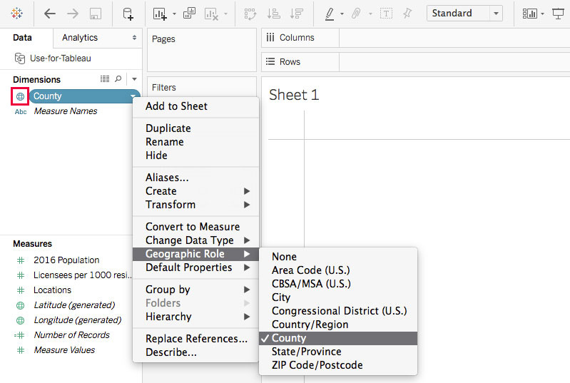
The globe icon means Tableau recognizes this as geographic data. If it doesn’t happen automatically, you can tell Tableau that these are counties.
4. Drag the dimension for your county names to the Rows tray, then choose the “Filled Map” option from the selection of chart types on the right. (If the options don’t automatically display, click the “Show Me” button in the top right.)
Tableau may need to work for a while to create your map…
5. Once your map appears, you’ll see the county boundaries. You’ll also see a number of gaps. These are counties that have the same name as some other county in the U.S., so Tableau isn’t sure where to display them.
- Click the “XX unknown” button in the bottom right of the map, then choose Edit Locations…
- The list of ambiguous county names will appear. At the top of the editing box, set the state to “Fixed” and choose Washington, then click OK.
- If this goes correctly, you should now see all the counties of Washington filled in with no gaps.
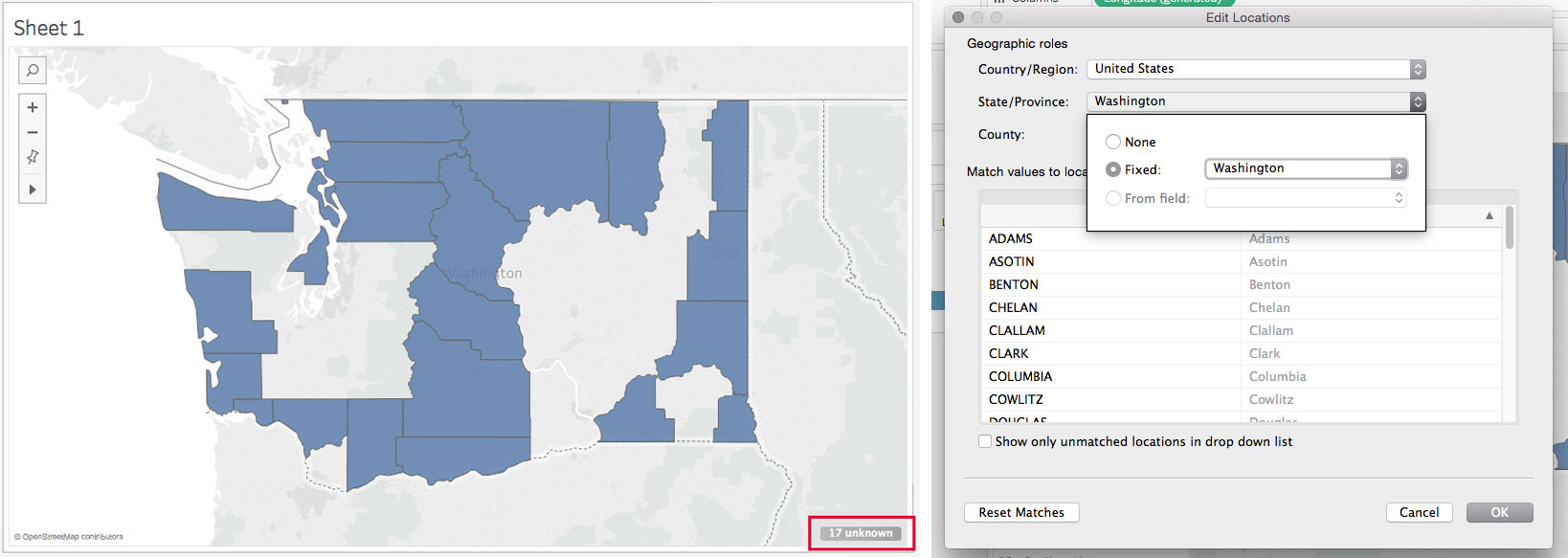
Counties with the same names as counties in other states won’t map immediately, but you can tell Tableau to place them all in Washington.
6. Now we’re going to change the map colors and some other labels.
- Drag the “Licensees per 1000 residents” measure into the Marks box, and assign it as a color variable. Now the map will show the liquor license data as a heat map using color, which makes this a choropleth map.
- Change the colors to a sequential color scale other than the default, making sure the darkest shade of the color represents the counties with the greatest number of establishments serving alcohol per resident.
- The variable for your county data should already be listed in the Marks box. Assign it as a Label variable to make the county names display on the map.
- Click on “Tooltip” in the Marks box and change the label for the liquor license ratio so it’s more understandable for someone who was reading this chart.
- Change the title of the map overall.
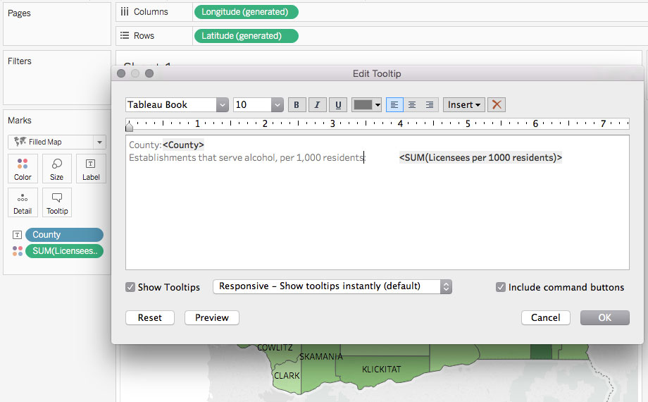
Edit the tooltip information that appears when you hover, among other colors and labels.
7. Next we’ll make a bar chart to show similar data.
- Click on the “Add Sheet” icon at the bottom to start a new chart.
- Drag the county name variable into the Rows tray, and the license ratio variable into the Columns tray.
- If it doesn’t happen automatically, choose the horizontal bar chart for the chart type.
- Click on the county variable in the Rows tray to display menu options, and choose Sort. Set it to “Descending” and sort by the license ratio field so the bars display in order from greatest to least, rather than alphabetical order.
- Choose a color for your bars that coordinates with the color scale you selected for your map.
- Give the chart an appropriate title.
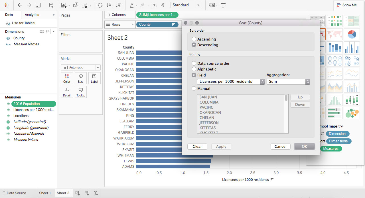
Sort the data so the bars appear in order with the largest at the top.
8. Finally, create a dashboard to display your two charts.
- Choose how to arrange the charts and make sure the labels are clear to someone who is not familiar with this data.
- Save your work to Tableau Public so you can publish your dashboard.
Written questions
In a separate document, answer these questions about the data and charts:
1. Why would it be useless to map the data about the number of licensed establishments without adjusting for population?
2. Given what you know about different parts of the state, what might explain why certain counties have above-average or below-average ratios? (If you’re not sure, take a guess.)
3. Do you think this data is more effectively communicated as a map or as a different chart type, and why?
4. Suppose you work for media strategy firm and one of your clients is a small family-owned winery in central Washington. The winery wants to expand their brand presence around the state and develop connections with local restaurants and chefs. What are two insights you could point out from this map during a planning meeting with this client?
Submitting Your Work
Complete your assignment by submitting the following materials to Canvas:
- Your completed spreadsheet
- Your Tableau dashboard link (make sure to test it)
- Text document with written responses