
In this assignment, you’ll get more practice in Tableau by creating two different charts that show the same data. We’re using data about WSU Athletics expenses from 2020-21, specifically the game-day expenses for each varsity team.
Universities report this information to the U.S. Department of Education each year as required by the Equity in Athletics Disclosure Act. You are welcome to explore all of the data, which also includes information about coaches’ salaries and the number of student-athletes on each team: Equity in Athletics Data Analysis Tool
1. Download this Excel file with the data, which is also included in the table below: WSUAthleticsOperatingExpenses2020-21.xlsx (Here’s the 2018-19 file and 2017-18 file if you want to compare.)
| Team | Gender | Operating Expenses |
| Football | Men | 1611478 |
| Men’s Basketball | Men | 970116 |
| Women’s Basketball | Women | 459033 |
| Baseball | Men | 693244 |
| Men’s Track & Field | Men | 360033 |
| Women’s Track & Field | Women | 290539 |
| Men’s Golf | Men | 110211 |
| Women’s Golf | Women | 110091 |
| Rowing | Women | 202692 |
| Soccer | Women | 199044 |
| Swimming | Women | 130077 |
| Tennis | Women | 135946 |
| Volleyball | Women | 239786 |
| TOTAL | 5512290 |
2. Start a new project in Tableau and bring in the data.
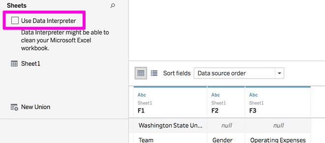
- Initially, Tableau will probably be confused about the row headers since this spreadsheet includes a title in the first row. Click the checkbox on the left for “Use Data Interpreter” to fix this.
- If you want to rename any of the columns, right-click on the column header and choose the “Rename” option.
- When your data is ready, click the Sheet 1 tab at the bottom to move on.
3. Make a bar chart to visualize the information.
- Hint: Move the team name variable to Rows, and operating expenses to columns.
- If you hover in the space right above the top bar, a little sorting icon will appear and you can click it to sort the bars from biggest to smallest or vice versa.
- Make sure to replace “Sheet 1” with a real title that explains the chart. Don’t forget to include “WSU” or “Washington State University” since we know that, but viewers may not.
- Change the color of the bars to something other than the default. One option is dragging the Gender variable to the color square to visually differentiate between men’s and women’s teams. For a challenge, you might try using colors from WSU’s newly updated brand guidelines.
4. Make a chart that visualizes the same information using circles (most likely a pie or bubble chart). The instructions are intentionally not too detailed for this section, because you should experiment or practice looking up Tableau resources.
- Make a new sheet. You can right-click the tab for your first chart and copy it if you want.
- Play around with the chart types and moving the variables around to see what happens. It’s surprisingly difficult to make a simple pie chart in Tableau! But that’s a worthwhile challenge, or there are other options, like the packed bubble chart. For either one, you don’t need variables up in the Rows and Columns area since there’s no axes or grid — instead it’s all about the Marks.
- Make sure your final version makes sense with a meaningful title and enough information to understand it.
5. Save your project to Tableau Public. This time, you can either download the charts to submit or save the link.
6. Answer these questions in a text document:
- Which chart do you think turned out better and why?
- Is there anything you wanted to make happen in Tableau that you couldn’t figure out? (Chart types, style preferences, colors, labeling, etc.)
- If you got to interview the person who keeps track of this data for all universities with athletics programs, what is one thing you would want to ask to better understand what this data means? (Could be small, like what they include in certain categories, or could be more big-picture)
Submit the Assignment
Complete the assignment by submitting the following materials to the corresponding assignment dropbox in Canvas:
- Your two charts, either as images or a Tableau Public link
- Your written responses