
In this assignment, you’ll get more practice working with pivot tables and Google Sheets to combine skills from previous assignments. This time we’re looking at where WSU students are from.
Part 1: Analyzing WSU student origin data
You can use Excel or Google Sheets for this portion, but Google Sheets is recommended since you’ll be creating Google charts for Part 2.
1. WSU Institutional Research used to publish enrollment data about where students are from (“Geographic Origin by Campus Fall 2012 – Fall 2018”). The university stopped publishing a public update in 2019, which is unfortunate. We’ll use the most recent update from 2018.
For this assignment, copy this spreadsheet so you have your own copy to work with: WSU Student Geographic Origin 2012-2018
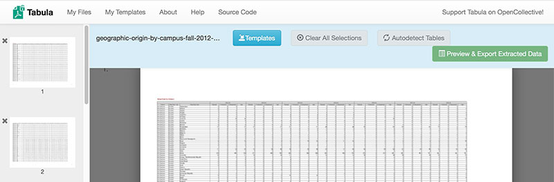
What it looks like when extracting data from a PDF using Tabula
In case you’re curious, here’s how the spreadsheet we’re using differs from the file posted by Institutional Research:
- Since the original is posted in an inconvenient PDF format that can’t easily be copied into a spreadsheet, I used an open-source (free) software program called Tabula that is made for exactly this problem of extracting tables from PDFs.
- Tabula created a CSV file that had the data mostly right. There were a few places where the columns didn’t quite align, so I had to go through and copy-paste a little to make sure everything was in the right place.
- When doing this, I also noticed a problem with the original IR file: The data for Afghanistan is repeated at the top of every page! So I deleted those extra rows.
- To simplify things for this assignment, I kept only the “All Campus” rows rather than separate listings for each WSU campus.
- I added a column, third from the left, to clarify the three main categories: 1) Washington state, 2) somewhere else in the U.S., and 3) international. This mostly duplicates the second column, but makes it easier to include U.S. territories such as Puerto Rico and American Samoa with the 50 states.
2. Look through the spreadsheet to understand what the different columns and rows mean.
- Each year (2012-2018) has four columns: three for different student categories (graduate, professional, and undergraduate) plus a column for the total.
- Each row represents a different geographic place where students could be from. These are split up differently based on whether students are from Washington, from elsewhere in the U.S., or from a foreign country. For example, we know exactly how many students are from Whatcom County in Washington state, but not how many students are from neighboring British Columbia since that’s lumped in with all of Canada.
In a text document, type the answers to these questions for submitting later:
- In 2018, were there more graduate or undergraduate students from Ukraine?
- Did the number of undergraduates from California increase or decrease between 2012 and 2018?
- Are there more WSU students from Whitman County or Thurston County in 2018?
- Name one country with zero students at WSU in 2018.
3. Make a pivot table to calculate how many students are from the three big categories (the column called “Geog Origin Category”): Washington state, U.S. not Washington, or International in 2018.
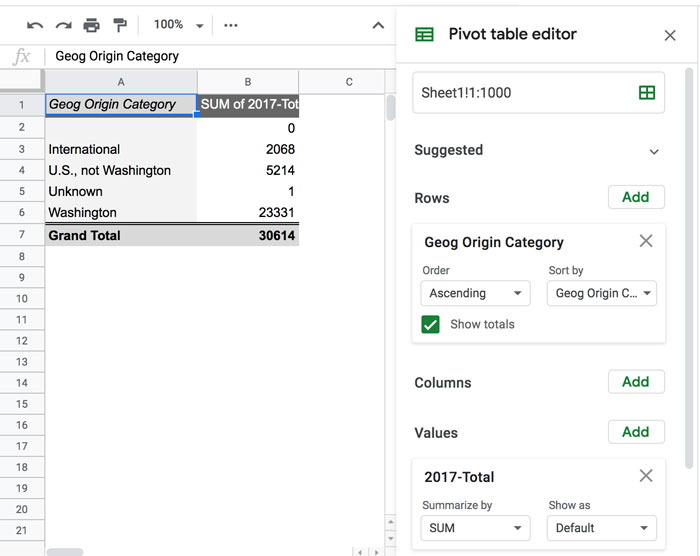
This pivot table purposely shows 2017 data to avoid giving away the answers. Yours should be for 2018.
4. Using the pivot table, make a pie chart showing those three categories.
- Use an appropriate title and labels so it’s clear what the chart shows.
- Publish the chart and save the link to submit later
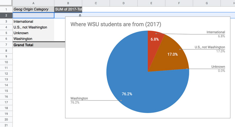
This pie chart shows 2017 data. Yours should show 2018 data (similar, but not exactly the same).
Part 2: Ask and Answer a Question
There are intentionally fewer instructions in this section, because it’s your chance to check your skills and work with this data independently. But you’re not on your own — please send an email if you get stuck or feel unsure about things.
1. Write out a question that can be answered with the data in this spreadsheet and represented in a chart. There are tons of possibilities! But if you’re not sure where to start, you can always ask a question about whether the number of students has increased or decreased from the place where you’re from.
2. Make a pivot table that can answer that question. Give it the old “does this make sense” test: Does the answer seem accurate and reasonable based on what you can tell just from looking at the spreadsheet?
3. Create a chart that shows the answer to the question you asked. Like before, include a meaningful title and labels, and save the published link to submit.
For example, I grew up in Minnesota, so I would have been included as a student from Minnesota back when I attended WSU. So I wondered: Is the number of students from Minnesota increasing or decreasing? I used a pivot table to isolate the “total” values for each year, then charted only the data for Minnesota. There are tons of options!
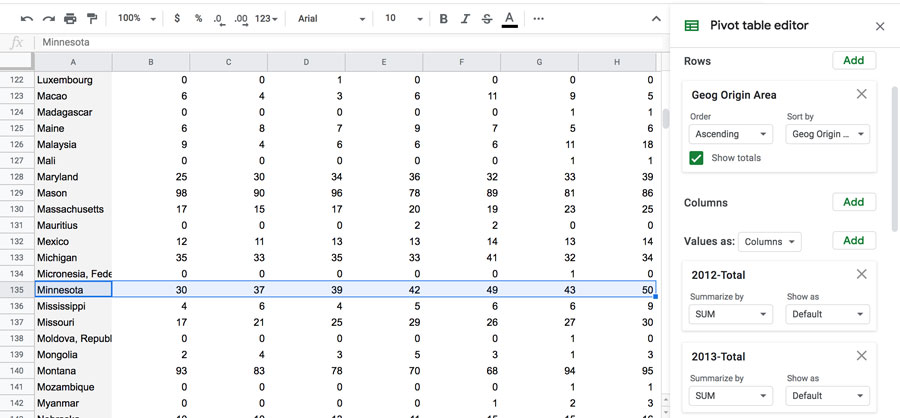
You can add multiple Values in your pivot table to choose which columns you’re interested in.
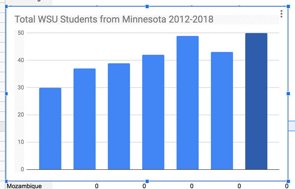
This is a good start on chart showing WSU students from Minnesota. It could use better labeling, but it’s understandable.
Submitting your assignment
Include the following as attachments with your submission:
- Text document from Part 1
- Link for pie chart from Part 1
- Link for chart from Part 2