Writing & Symbols
Oftentimes writing and visuals are seen as separate in media. But all writing is a visual system for language, so it’s important to understand how writing systems developed and evolved into modern typography.
Key ideas:
- Writing is a particularly important use of visual symbols
- Visual cues in writing help us assess meaning and credibility
- Words powerfully affect how we understand images
Related slides for reference
✓ Lecture Review: What does it mean that our modern understanding of ancient writing is shaped by the durability of different civilizations' records?
The Printing Press
As mentioned in the previous lecture video, Gutenberg was not the inventor of the earliest printing press, though he very successfully made it popular in Europe. Watch this video about a still-operating moveable type printing press in Korea, where the first known printing press was located. This is an interesting feature, and helpful for understanding how moveable type printing works.
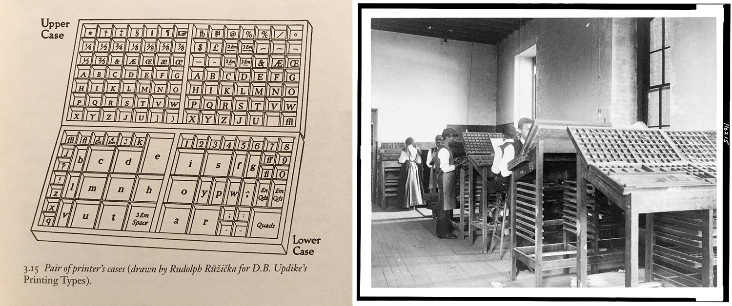
Did you know? When we say “uppercase” and “lowercase” letters, this is a reference to moveable type. Lead type of a particular size and typeface would come in a case, with the capital letters in the upper portion of the case and the small letters in the lower portion. These cases are still a pretty common item at antique markets and people like to use them in decor.
Typography
These days, we often interact with fonts as one big list of options in software programs. But it is important to understand that fonts were invented over time, and influenced by broader design trends and fashions the same way architecture, clothing and other products have changed. This video is produced in a creative way and succinctly describes the main categories of fonts or typefaces.
✓ Review: What is a serif? What does the “sans” in sans serif mean?
Font or Typeface? In this course, we will use “font” and “typeface” interchangeably, although technically there is a difference. A typeface is the overall design, like Arial, Times New Roman, Verdana, etc. The font is the specific version. This made more sense in the past when you actually had to buy a new case of letters if you wanted different sizes, bold and italic, etc. It’s kind of like how a classic novel or musical album may have many different versions available — “Catcher in the Rye” is like a typeface, and different formats available — a high-quality hardcover book, a flimsy mass-market paperback, an ebook, etc. — are equivalent to the font. Even today, if you look very closely you may notice that not all versions of “Helvetica” or another common font look the same on every computer and website.
Font Category Activity
Serif and Sans Serif are the two main font categories. Others that are primarily decorative can be categorized together as Display fonts. Display fonts can include ones that resemble handwriting, both casual handwriting and formal script handwriting. These categories are further explained and illustrated in this week’s Glossary of Typographic Terms reading.
Let’s review:
- Download and print this worksheet: Categorizing Fonts Worksheet
- Cut on the dotted lines and sort the different fonts into the correct categories.
- Check the answer key when you’re done.
All of these fonts are standard fonts found on most computers, or from Google Fonts, which is a good source for finding new fonts to use for both web and print projects.
🗨 Some fonts don't neatly fit into one category, especially newer fonts that mix traditions in creative ways. What are two fonts from this activity that you think could fit into more than one category?
Designing and Choosing Fonts
To get a sense of what challenges typographers deal with, play these games related to type. (They’re pretty difficult, so just do your best!)
- Shape Type: Try to make well-balanced letters using tools similar to Illustrator
- Kern Type: Move letters horizontally for the most balanced spacing
- "I Shot the Serif": Differentiate serif letters from sans serif letters
🗨 What is one thing you learned or noticed about typography choices while trying out these games?
Why Typography Matters
If you like to watch the Academy Awards show each year — aka the Oscars — you may remember an enormous mistake a couple of years ago when the wrong winner was announced for Best Picture. Watch it happen here (play video from start to 1:45):
Yikes, super embarrassing. So, it turned out what happened is that the actor announcing the award at the beginning, Warren Beatty, had been handed the wrong envelope. He’s not dragging it out for the suspense, he’s just genuinely confused about the card. At the Oscars, it’s a whole thing where two accountants have matching sets of envelopes on either side of the stage that they guard carefully and hand to presenters. One of these people got a little distracted hanging out with celebrities and gave the card for Best Actress, which had already been presented. (Yes, he lost his job.)
So how it this entertainment business fiasco is related to typography? As the correct card was held up to verify the winner during the show, graphic designers noticed that the design of the cards — with OSCARS in large type at the top and the category in tiny italics at the bottom — contributed to the confusion. Here’s one designer’s idea for how to improve the design:
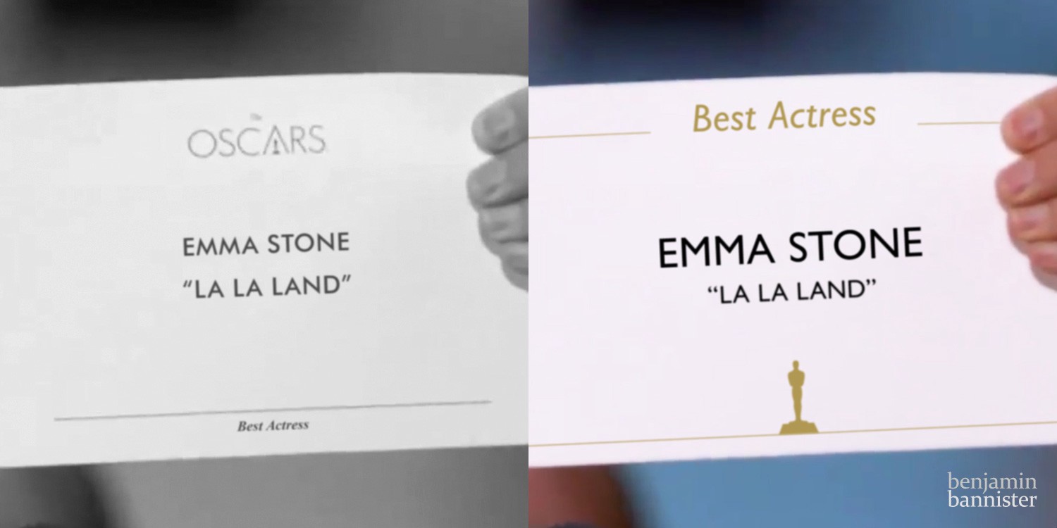
By putting the category prominently at the top and the name to read clearly in the middle, it’s less likely that a presenter could misread the card. There’s no informational need to have “Oscars” on the card (obviously they’re at the Oscars), so that can be replaced by an icon at the bottom that establishes the brand without getting in the way of the information that needs to be read aloud. This is an example of hierarchy — using characteristics of text such as size, placement, color and style to guide the viewer to the most important information.
Remember our key ideas for this week?
- Writing is a particularly important use of visual symbols
- Visual cues in writing help us assess meaning and credibility
- Words powerfully affect how we understand images
This is all about the middle idea. There are some good examples of this in the “How Typography Can Save Your Life” reading, including how NASA wrote a report about how small changes in typography could prevent critical errors, including an emergency plane landing in 1987 partially caused by a difficult-to-read checklist.
Even when we know what a word is supposed to say, any secondary interpretation distracts from your message. This informal lecture video goes through a few examples of how to avoid typography missteps:
User-Centered Typography
- Typography that’s meant to be read should always make readability a priority
- Guide the reader with hierarchy and flow
- Avoid using decorative fonts for more than a heading or title, and only at large sizes
- Use italics for emphasis, not as a text style
Improving Readability
Consider all elements of your text layout:
- Choice of typeface style
- Text size and x-height (not all 12pt is equal)
- Kerning, tracking, leading
- Text alignment and justification
- Line length and column width
🗨 Think about all the books, websites and online platforms you regularly have to read this semester. What is one example of text you find difficult or frustrating to read? What about the visual styles makes it especially difficult to read?
How do you adjust those characteristics in Adobe InDesign? This video shows you how: